Five golden stars arranged in a horizontal row.
Educational BI Content from Reporting Hub

Top 10 Power BI Dashboard Examples for 2025

Discover How to Build Your Own
Data visualization is key to effective analysis, and Microsoft Power BI excels with its customizable visualizations and user-friendly interface. As part of the Microsoft Power Platform, it integrates seamlessly with other Microsoft tools, allowing users to create visually appealing dashboards that highlight key performance indicators (KPIs) and support better decision-making.

Power BI is a platform useful for data visualization and reporting. It is designed and used by both business analysts and newer users, making it accessible to a wide range of people.

Smiling man with short dark hair wearing a dark shirt against a blue gradient background.
Brian DeLuca
15 min read . March 1, 2025
Image of slider-dash

Introduction to Power BI

Microsoft Power BI is a powerhouse for data visualization, designed to meet the diverse business intelligence needs of all professionals, from seasoned data experts to newcomers. Power BI dashboards are user-friendly and customizable, making data analysis accessible at any skill level.

The platform brings data to life through various formats, including charts, graphs, maps, and scatter plots. With the “AI Insights” tool, Power BI leverages artificial intelligence to uncover hidden insights within your datasets.
Power BI is part of a suite of interconnected applications within the Power BI ecosystem, which includes:
Icon
Power BI Desktop
For creating detailed reports and visualizations.
Icon
Power BI Pro
Unlocks advanced analytics and collaborative features.
Icon
Power BI Premium
Offers enhanced performance and capacity.
Icon
Power BI Mobile
Enables access and interaction with reports on the go.
Icon
Power BI Embedded
Allows seamless embedding of Power BI content into custom applications.
Icon
Power BI Report Server
Provides secure, on-premises report management.
As a low-code tool within Microsoft's broader Power Platform, Power BI integrates with other applications such as Power Apps, Power Pages, and Power Automate. This integration empowers businesses to analyze data, visualize insights, create business solutions, automate processes, and develop chatbots, all without requiring deep coding expertise.
For data analysts, Power BI Report Server is ideal for secure on-premises report management, while Power BI Mobile ensures they can access and interact with reports anytime, anywhere, facilitating swift and informed decision-making.

What is a Power BI Dashboard?

Power BI dashboard is a tool designed to highlight a company's key performance indicators (KPIs) and data insights, following best practices for clarity and impact.

Regardless of your experience level, Power BI dashboards can track various metrics,
from . financial performance and . business growth to
. conversion rates.
Power BI enables the transformation of data from diverse sources into meaningful and impactful visuals, helping users extract actionable insights and make informed decisions.
Whether you're using a Power BI Showcase or creating custom dashboards, the goal is to turn raw data into clear, insightful visuals.
power-bi-dashboard Image
Image of power-bi-dashboard
Image of use-power-bi-dashboards

Why Use Power BI
Dashboards?

Power BI dashboards are your business's control center, providing a quick snapshot of your critical metrics. They blend on-premises and cloud data from multiple sources, offering a unified view of your data landscape.

Dashboards are dynamic and interactive, with real-time refreshing tiles that keep your insights current.

This ensures you're always ready to make informed decisions based on the latest data.
Abstract background with a diagonal split between light blue and dark navy blue colors.

Who Can Create Power BI Dashboard?

Creating a Power BI dashboard is a feature reserved for users with edit permissions on the report.

These permissions are granted to the report creators and any colleagues they designate. For example, if a report is created in workspace ABC and you are added as a member, you both have editing capabilities.

Icon
Report Creators & Designated Colleagues

Can edit reports and create dashboards if they have been added as members to a workspace (e.g., Workspace ABC).

icon of report-consumers
Report Consumers

Cannot create dashboards or pin tiles. Access is limited to viewing shared reports or Power BI apps.

icon of user-with-license
Users with Power BI Pro/PPU License

Can create dashboards in shared workspaces.

icon-user-in-workspace
Users in My Workspace

Can create dashboards without needing a Pro or PPU license, offering flexibility for independent work.

Background Image of dark-section-bg-bottom

Enhance the Distribution of Your Power BI Dashboards with The Reporting Hub

Effortless sharing of your Power BI dashboards without extra costs or complexity.
While creating compelling Power BI dashboards is a significant step toward data-driven decision-making, we know that distributing them efficiently can be a hurdle—especially when sharing with a broad audience without incurring extra licensing costs.
This is where The Reporting Hub comes into play. After working as analytics consultants and BI developers for many years, we created a Microsoft-endorsed no-code solution that simplifies how you share your Power BI content.
Our platform enables you to:
User Image
Easily Distribute Content
Share your Power BI dashboards with both internal teams and external clients without the need for additional Power BI licenses.
illustration-control-access-with-granularity
Control Access with Granularity
Manage who sees what with user-level access controls, ensuring the right people have the right access.
Icon
Secure Your Data
Rely on enterprise-grade security through Microsoft Azure, providing a trustworthy environment for your sensitive information.
Icon
Scale Effortlessly
Grow your reach with our robust, multi-tenant platform featuring white-label capabilities and integrated billing, all designed to scale with your business needs.
At The Reporting Hub, we eliminate the complexities associated with dashboard distribution. By making it easier to control access and share insights without additional costs, we empower you to focus on maximizing the impact of your data.

What is the Difference Between a Power BI Dashboard and Report?

Power BI offers both dashboards and reports for visualizing and communicating data, each serving distinct purposes:
Dashboards
Reports
Purpose
High-level monitoring tools providing a consolidated view of business performance, often in real or near-real time.
Designed for in-depth analysis and exploration, answering complex business questions with detailed data.
Interactivity
Limited interactivity to maintain clarity and simplicity.
Rich interactivity with features like drill-through, filtering, and highlighting, allowing deep data exploration.
Structure
Typically single-page, displaying multiple visualizations for a quick overview.
Can be multi-page, organizing various visualizations and data tables across several pages.
Data Updates
Built for real-time or near-real-time updates, ideal for monitoring live data.
Often focus on historical data with periodic updates, supported by scheduled refresh capabilities.
Use Case
Ideal for quickly sharing key insights across an organization.
Suited for detailed analysis, enabling users to explore specific data aspects in depth.

Power BI Dashboard Examples

Sales Performance Dashboard

Power bi sales-performance-dashboard
This dashboard provides a comprehensive view of a sales team's activities and results.
Interactive funnel charts show how leads convert into deals, with filters allowing analysis by country, sales representative, and reasons for lost deals.

This dashboard provides a comprehensive view of a sales team's activities and results.
Abstract background with a diagonal split between light blue and dark navy blue colors.

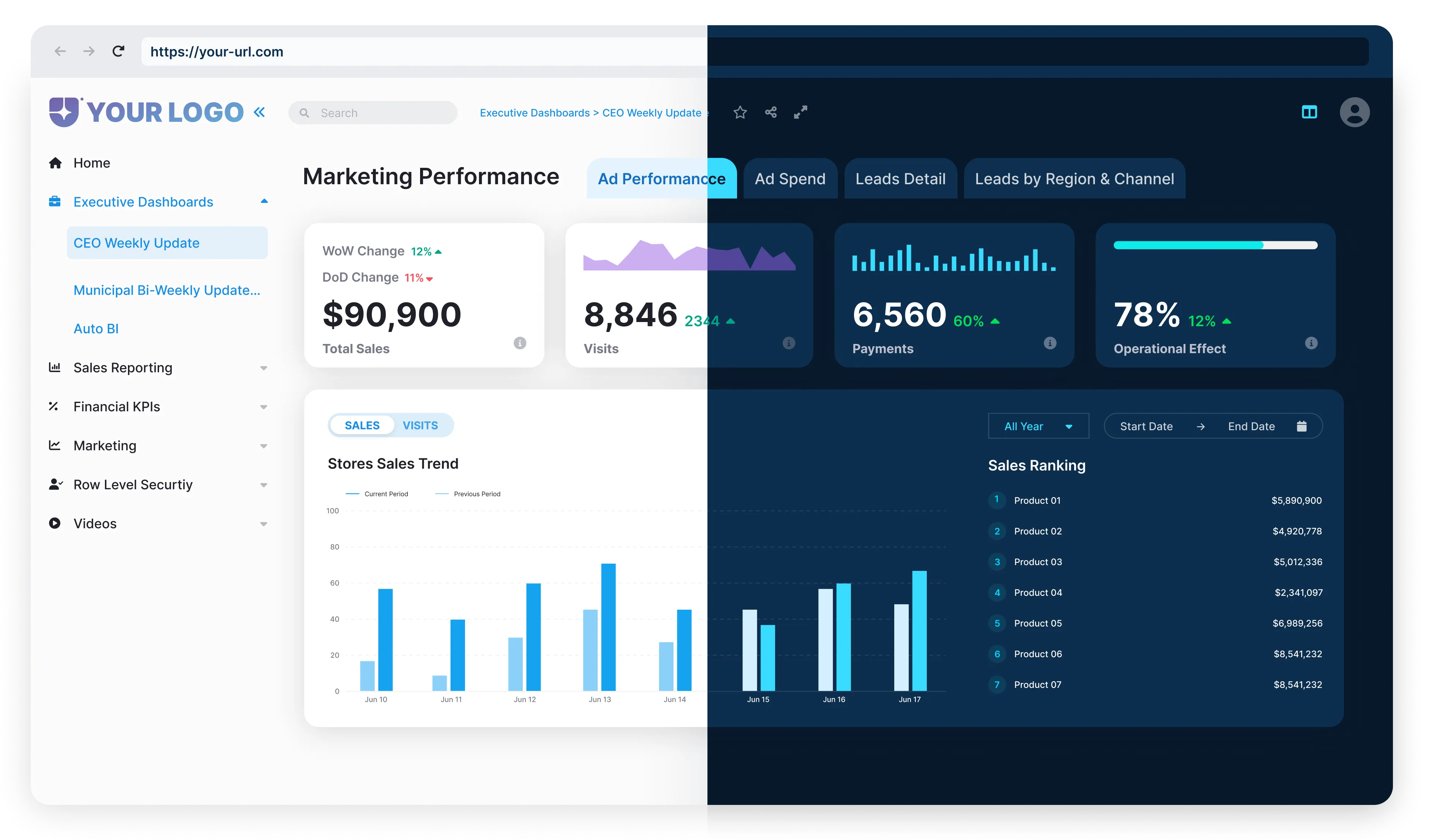
 Marketing Campaign Dashboard

Power bi marketing-campaign-dashboard
Gain insights into marketing spend and outcomes with detailed breakdowns of product and total sales.
This dashboard transforms raw data into clear, actionable insights, making it easier to allocate budgets effectively and enhance marketing strategies.

Background Image of dark-section-bg-bottom

Financial Analysis Dashboard

Power bi financial-analysis-dashboard
Track financial health with key ratios like Return on Equity (ROE), Current Ratio, Quick Ratio, Debt-to-Equity Ratio, Earnings Per Share, and Price-to-Earnings Ratio.
This dashboard turns financial data into powerful insights for informed decision-making.

Customer Insights Dashboard

Power Bi customer-insights-dashboard
Utilize analytical algorithms to discover insights in your data, such as low variance, anomalies, trends, and KPI analysis.
This dashboard helps identify sales patterns, detect anomalies, and compare current values to targets for better business insights.
Abstract background with a diagonal split between light blue and dark navy blue colors.

Supply Chain Dashboard

supply-chain-dashboard Image
Monitor critical metrics with a visually appealing and consistent color scheme.
The first page provides an overview of essential metrics, with deeper analysis available through regional data and detailed order tables.
Interactive visuals and an intuitive design enhance data exploration.
Background Image of dark-section-bg-bottom

HR Analytics Dashboard

hr-analytics-dashboard Image
This dynamic dashboard brings key HR metrics to life, offering a summary page for quick KPI overviews, headcount details, termination data, and recruitment statistics.
It provides a comprehensive view of the workforce and hiring efficiency.

Product Performance Dashboard

product-performance-dashboard Image
Analyze product budgeting with real-time monitoring of KPIs through various charts, graphs, tables, and filters.
This dashboard aids in tracking product performance and planning budget allocations effectively.
Abstract background with a diagonal split between light blue and dark navy blue colors.

Operational Efficiency Dashboard

operational-efficiency-dashboard Image
This live dashboard updates in real-time, providing insights into customer support activities.
It tracks open cases, popular support channels, and team member performance, ensuring the team and stakeholders stay aligned.
Background Image of dark-section-bg-bottom

Healthcare Analytics Dashboard

healthcare-analytics-dashboard Image
Manage hospital emergency responses efficiently with this dashboard, which aggregates data on bed availability, equipment usage, and patient status.
It helps staff quickly assess situations, identify needs, and allocate resources effectively.

Risk Management Dashboard

risk-management-dashboard
Monitor and analyze risks with key risk indicators (KRIs) and metrics.
This dashboard helps identify risk issues, monitor trends, take prompt actions, and communicate risk profiles.
It consolidates data from various sources for a comprehensive view of operations, risks, and complian

How to Create Interactive Power BI Dashboards?

Creating an interactive dashboard in Power BI is straightforward and highly effective. Follow these steps to build your own:
Blue circular icon with a white puzzle piece and checkmark inside.
Manage Data Model Relationships
Ensure that all data relationships are correctly established within your data model.
Blue circular icon with a white puzzle piece and checkmark inside.
Manage Data Model Relationships
Ensure that all data relationships are correctly established within your data model.
Blue circular button with a white share icon and glowing effect.
Manage Data Model Relationships
Ensure that all data relationships are correctly established within your data model.
Horizontal line with evenly spaced glowing blue dots connected by blurred blue lines on a dark background.
Manage Data Model Relationships
Ensure that all data relationships are correctly established within your data model.
Blue circular icon with a white cloud and two arrows pointing up and down inside it.
Manage Data Model Relationships
Ensure that all data relationships are correctly established within your data model.
Blue circular button with a white calculator icon showing addition, subtraction, multiplication, and division symbols.
Manage Data Model Relationships
Ensure that all data relationships are correctly established within your data model.
Blue circular icon with a white pie chart symbol inside, indicating data visualization.
Smiling man holding a laptop with a blue circle and star pattern background.

Tips for Crafting Interactive Dashboards

Know Your Audience
Focus on the data that is most relevant to your audience and how they will interact with it.
Use Built-in Features
Enhance interactivity with filters, slicers, and drill-throughs.
Keep it Engaging
Aim for a dashboard that is not only informative but also engaging and easy to navigate..
Creating an interactive dashboard in Power BI is straightforward and highly effective. Follow these steps to build your own:

Optimizing Power BI Dashboards for Performance

optimizing-power-bI-dashboards
By implementing these optimization strategies, you can create lightning-fast, efficient Power BI dashboards that make data analysis seamless and enjoyable.