
Most analytics reports fail to hold user attention. They’re accessed briefly, scanned for surface-level information, and quickly abandoned, leaving insights untapped and effort underutilized.
In client-facing dashboards or internal analytics, engagement is what turns reporting into real business impact. It drives better decisions, stronger relationships, and higher adoption. But designing for engagement doesn’t happen by accident. It takes an intentional approach guided by how users think, move, and interact with your data.
In this post, we’ll cover Power BI user engagement best practices to help your reports drive real impact.
You’ll learn how to design experiences that keep users exploring, clicking, and coming back.
What Is Design-First Analytics?
Lack of user engagement in analytics affects more than just experience; it threatens the success of your entire reporting effort. When users quickly glance at a Power BI dashboard and leave without interacting, it signals that the report isn’t connecting. Common signs include high bounce rates, abandoned dashboards, and minimal use of filters, drilldowns, or page navigation.

Insights go unused
Critical trends and exceptions are often overlooked, which limits data-driven decision-making.

Decisions stall
Without clear data guidance, teams hesitate or rely on assumptions.

Client satisfaction drops
Disengaged users lose trust in your reporting solutions.

Platform ROI declines
Investment in data infrastructure and visualization yields little value.
In embedded analytics environments, low engagement is especially costly. It reduces user retention, limits ongoing value, and increases churn risk, jeopardizing the broader client experience.
Designing for engagement is essential for converting analytics into business outcomes.

What Is Power BI Report User Engagement?
Power BI report user engagement measures how effectively users interact with your dashboards and reports. It captures not just report access, but user actions that dive deeper down to how many times users filter, drill down, or view different data in general. It captures greater depth of engagement outside of just traditional logins or page views.
Key aspects of user engagement include:

Adoption:
How many users regularly access the reports?

Frequency:
How often do users return – daily, weekly, or monthly?

Interactions:
Are users applying filters, drilling down, or using slicers to explore data?

Time Spent:
How long do users stay engaged during each session?

Value Delivered:
Are users gaining actionable insights that lead to better decisions?
While the default usage metrics in Power BI are read-only, you can save a copy of the report and customize it to analyze engagement. You can even create custom reports against the model of underlying usage data, so you can analyze user engagement at the workspace level. For cross-workspace analysis, use Power BI Activity Logs or Graph API.
Understanding trends in usage helps point out reports that are adding value to users, as well as reports that may deserve some additional critical attention. For analytics teams that provide embedded analytics—especially branded multi-tenant environments – understanding usage metrics is even more important to help prove ROI, understand user experience, and cultivate users toward continued engagement and increased adoption.
Who Benefits from Better Report Engagement
A successful report user engagement generates benefits for multiple actors in the delivery and use of the analytics reports.

End users and decision-makers
Enjoy faster, clearer insights through intuitive dashboards that minimize the need for data team intervention. This leads to quicker decision cycles and less support overhead.

Analysts and BI professionals
Experience fewer disruptions from user queries, as engaged users can self-serve insights within reports. This shift improves efficiency and allows teams to focus on advanced analytics.

Analytics providers and service vendors
Grow retention and revenue opportunities by delivering branded, embedded reports that users trust and value. Subscription-based reporting models increase platform stickiness and client loyalty.
Ongoing feedback collection and usage monitoring create a foundation for continuous report optimization and business growth.

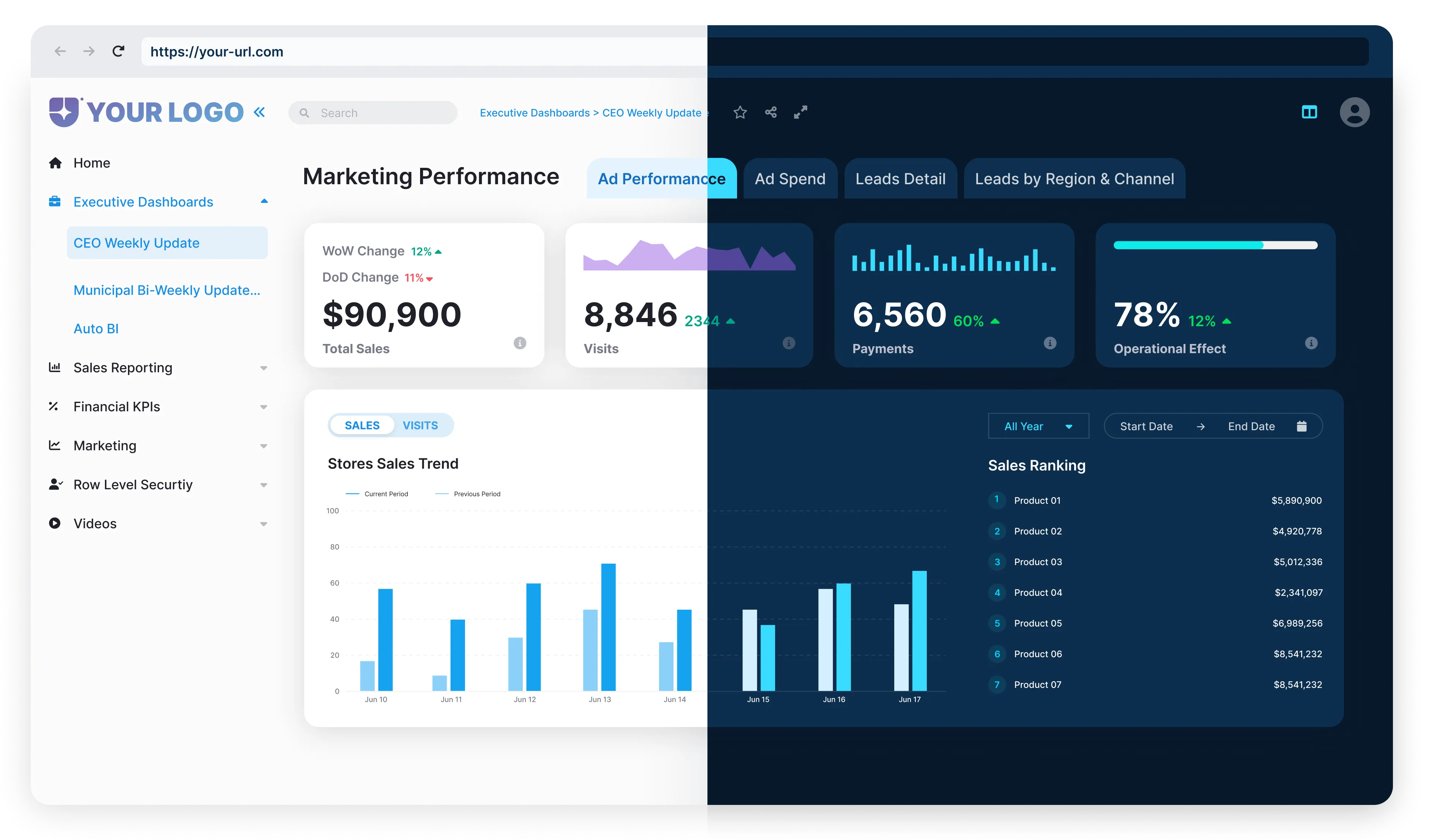
How Design Affects Power BI Report Engagement
The structure and elements within a Power BI report directly impact how users interact with it. For example, the number of visuals on a report can affect engagement levels. Reports with too few visuals may not encourage much exploration, while those overloaded with visuals risk overwhelming users and reducing interaction.

Measuring how different design components, such as visuals, bookmarks, slicers, and buttons, correlate with user engagement across a portfolio of reports can reveal valuable insights. Understanding these relationships helps identify the balance between providing enough functionality and avoiding clutter that discourages use.
Third-party monitoring tools or custom frameworks can assess report complexity, usability, and engagement by scoring design. These scores highlight which reports engage users effectively and which may require redesign to improve adoption.
By analyzing engagement metrics against design factors, it becomes easier to pinpoint reports that are too complex or underutilized due to poor design choices.
This targeted insight supports ongoing improvements, ensuring that dashboards deliver both a modern experience and practical usability that keeps users engaged longer.
What Increases Time Spent in Your Reports

Embed reports where users already work
Embedding dashboards directly in a branded portal or application removes friction. Users don’t need to switch tools, making it natural to engage with reports more often and for longer periods.

Create tailored experiences by role, department, or client
Custom views reduce noise and cognitive load. When each audience sees only the metrics that matter to them, they can focus on insights instead of searching for relevant data.

Streamline report flows
Minimizing unnecessary visuals, simplifying navigation, and using efficient slicers improve load speed. Faster, smoother reports encourage deeper exploration.

Use data-driven layouts
Monitor how users interact with your reports and adjust placement, visuals, and filters accordingly. Designing around real behavior leads to interfaces people want to revisit.

Align scheduled refresh with data source updates
Set your cache update frequency to match your data source refresh schedule. This keeps reports accurate without overloading the system, ensuring users always see timely, relevant insights without unnecessary processing.

Choose light backgrounds for versatility
Reports with white or light backgrounds are easier to print, share, and read across devices. This simple design choice improves accessibility both online and offline, making your content more versatile.

Keep numbers short and readable
Limit numbers to four digits and two decimal places for cleaner visuals. Consistent number formatting reduces cognitive load and helps users focus on meaning instead of decoding large values.

Leverage tooltips for context
Use tooltips to add deeper explanations or related data without crowding the main view. Well-chosen tooltip visuals give users extra context exactly when they need it, boosting comprehension.

Name objects clearly
Use business-friendly names for measures and columns, and hide anything unused. This makes reports easier to navigate and keeps attention on the most relevant elements.

Align scheduled refresh with data source updates
Set your cache update frequency to match your data source refresh schedule. This keeps reports accurate without overloading the system, ensuring users always see timely, relevant insights without unnecessary processing.
Unlocking the Full Value of Power BI Through User Engagement

Power BI report engagement is the vital link between data and real business outcomes. Without it, dashboards risk being forgotten or underused. Thoughtful design shapes user behavior, how often they return, how they navigate, and the insights they uncover.
Treating design as a strategic part of your analytics program ensures your reports deliver meaningful value.
One way to achieve this is with solutions like Reporting Hub, which enables organizations to provide fully branded, embedded Power BI reports that are both intuitive and engaging. Delivered through a customizable, no-code portal hosted on your Azure environment and your own domain, this creates a seamless experience that keeps users exploring and engaged longer.
With the right embedding setup (e.g., workspaces, RLS, or dedicated capacities), solutions like Reporting Hub can support multi-tenant experiences tailored by role, department, or client, aligned with the tailored design principles that boost engagement.
Combined with enterprise-grade security, flexible authentication, and robust sharing features, it ensures data is accessible yet secure, empowering teams to collaborate effectively while maintaining control.