
You’ve got data. Lots of it. Sales numbers, customer feedback, website clicks, inventory logs, the list goes on. But here’s the thing: most of it just sits there. Disconnected. Messy. Hard to use. If your data lives in silos, spreadsheets, CRMs, or legacy systems—it’s hard to see the full picture. Power BI helps unify and clean it, even if you’re starting from scratch.
Turning that raw data into real insights is what sets growing businesses apart. Businesses can’t afford to guess anymore; you need real answers, backed by data. That’s where Power BI comes in. It connects all your data, cleans it up, and turns it into clear, visual stories. So you can stop digging and start deciding.
In this guide, we’ll show you how to unlock Power BI business insights at every level. From the first data import to the dashboards your team uses.
What Counts as ‘Raw Data’?
Human-centered design is all about creating tools that are truly useful by focusing on the people who use them. It means understanding their goals, the decisions they need to make, and the actions they want to take.
In BI, that goes beyond just showing charts. It’s about designing a comprehensive experience that supports the entire decision cycle, from identifying trends to testing hypotheses and taking action. That might mean telling a clear story with the data, or building features right into the dashboard that let users respond in real-time.
The challenge? It’s all scattered. Different formats. Different sources. No easy way to get a full picture.
That’s where tools like Power BI Embedded help. You can pull raw data from multiple systems, model it in one place, and turn it into live dashboards inside your app or portal. No more exporting files or juggling reports across teams.
Step 1: Connect All Your Data Sources in Power BI
Data is only useful if it’s all in one place. Power BI makes that possible. Instead of switching between tools, you can bring together data from Excel, SQL, cloud apps, or even your platform, all inside one unified workspace. That means less time digging and more time seeing the big picture.
Let’s say you manage sales, marketing, and finance data separately. With Power BI, you can connect those systems, spot trends across departments, and uncover what’s helping or hurting your results.
For secure embedding, Power BI Embedded (Azure-based) is ideal for customer-facing apps. For internal teams, consider SharePoint integration or ‘Publish to Web’ (public).No extra logins. No clunky exports. Just live, interactive reports where your team already works.
The result? Less manual work. More clarity. And faster decisions based on real data.
Key benefits of connecting your data in Power BI:
Step 2: Build a Data Model That Tells a Story
Once your data is connected, the next step is building a model that makes sense. Power BI lets you organize your data into a structure that reveals key relationships and trends. Use a star schema to simplify relationships: one fact table (e.g, sales transactions) linked to dimension tables (products, dates). Avoid circular dependencies that slow down refreshes.
By consolidating data from different sources—like CRM, social media, and ERP systems—you can create interactive, easy-to-navigate dashboards that help you spot what really matters.
Benefit: You save time, eliminate confusion, and get actionable insights into your performance in one place. No more jumping between apps to find the numbers you need.
What to expect:
Power BI’s flexibility allows you to model data in ways that tell a compelling story and drive better decisions.

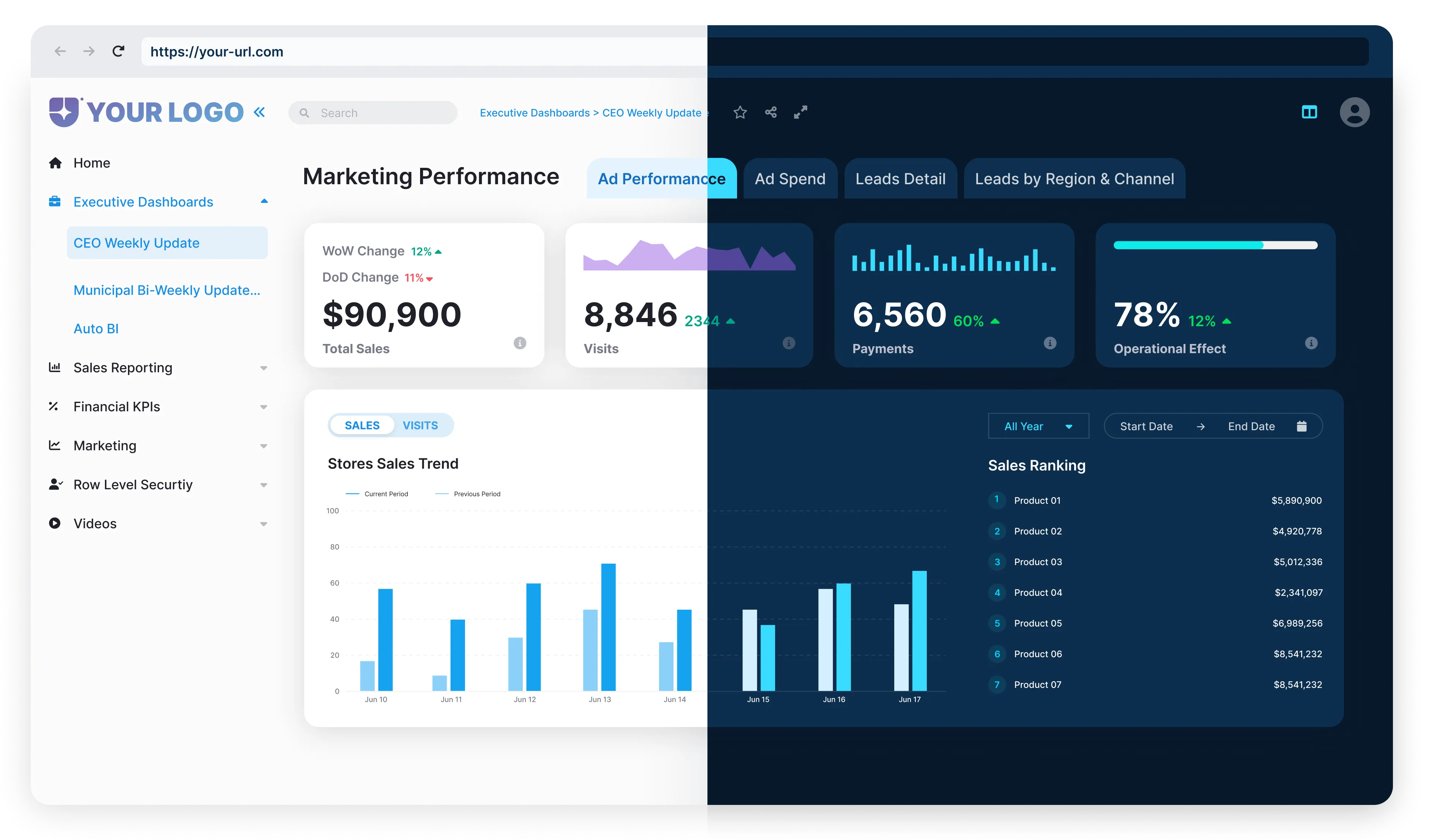
Step 3: Visualize What Matters
Now that your data is cleaned and modeled, it’s time to turn it into something people can use. Power BI makes this easy.
With drag-and-drop tools and interactive visuals, you can build dashboards that tell clear, compelling stories without needing a background in data. From bar charts that break down sales by region to heatmaps showing customer behavior, Power BI helps you turn numbers into insights your team can act on.
It’s not just about good-looking charts. The goal is clarity. Real-time filters, AI-powered visuals, and integration with tools like OneLake mean your dashboards stay accurate and easy to explore.
AI visuals need clean, categorized data. For example, mark ‘Region’ as a geographic field to enable map visuals.
You’re not just reporting data, you’re helping everyone focus on what matters most.
Step 4: Use AI to Unlock Deeper Insights
Dashboards give you the big picture. AI helps you spot what you might’ve missed. In Power BI, anomaly detection works best with daily/weekly time-series data (e.g., sales over 12 months). For ad-hoc analysis, try manual outlier filters. You’ll get smart suggestions and visual cues when something looks off or starts to shift.
Let’s say churn is creeping up, or a product line is outperforming expectations—Power BI surfaces those insights for you. You can even go deeper with features like clustering and anomaly detection. And if you’re working with predictive models or forecasts, the connection to Azure Machine Learning makes that easy too.
Whether you’re running analysis yourself or partnering with a data scientist, Power BI helps you move faster and stay ahead.


Conclusion: Bring It All Together with Reporting Hub
Turning raw data into business insights is no longer a manual, time-consuming process. With Power BI, you can connect your data, build meaningful models, visualize key metrics, and uncover trends using built-in AI, helping your team move faster and make smarter decisions.
Reporting Hub scales Power BI embedding without per-user fees, but performance depends on your Azure capacity tier.
Whether you’re building client portals or internal reporting tools, Reporting Hub makes it simple to scale Power BI on your terms. Explore Reporting Hub and start delivering insights with speed, flexibility, and a branded experience.