
Analytics doesn’t live in the background anymore. It’s front and center, and in many cases, the data itself is the product. But here’s the problem: too many analytics teams are still stuck delivering insights through patchwork processes, manual packaging, and dashboards that don’t scale. The result? Great analysis gets lost, ignored, or misunderstood.
To make data work, it needs to be delivered like any other high-value product: polished, easy to use, and built for scale. That’s where organizations are finding success by starting to productize Power BI. When analytics are embedded into seamless, branded experiences, teams don’t just get reports, they get insights they can trust and act on.
The Problem: Great Data, Poor Experience
Data teams invest countless hours connecting data sources, building complex models, and designing insightful Power BI dashboards. But when it comes time to share those insights? Engagement drops off fast. The issue isn’t the data, it’s the experience around it.
Inconsistent experiences make users ignore even the best visualizations and KPIs.

In a 2025 leadership survey covering the US and Europe, executives shared their struggles with dashboard overload. They’re flooded with data and reports every day, and instead of feeling empowered, many feel overwhelmed. About half say there’s just too much data to handle, and even though 77% rely on dashboards, most only glance at them or don’t question the data. Around two-thirds worry that leaning too heavily on dashboards might cause them to miss critical opportunities or lead to decisions based on faulty information.
Users often run into outdated portals or disconnected reports that make finding the right data frustrating. Dashboards don’t always feel branded or polished, and self-service options are missing. Switching between clients or departments is a hassle, and manual update processes slow down the flow of fresh data, hurting trust.
Even if your dashboards have rich visuals and KPIs, inconsistent or difficult user experiences cause people to stop using them. More than half of executives admit they don’t regularly turn to their company’s dashboards, not because data isn’t important, but because the experience doesn’t meet their expectations.
What users want is data that speaks clearly and tells a story they can follow. They want clean visuals, easy access, and layouts that simplify complex info. Without the right platform, your dashboards won’t hold their attention, no matter how smart your analysis is.
Data Consumers Expect Product-Grade Experiences
Think about the apps we rely on daily: Notion, Slack, Figma. They’ve trained users to expect intuitive design, instant access, and personalized experiences. Your analytics can’t feel outdated by comparison. Users want dashboards that look polished, respond quickly, and deliver insights tailored to their role, without asking IT for help.
The shift is clear: successful teams are now productizing Power BI.
That means creating embedded, mobile-ready, client-friendly environments with row-level security and customizable views. With AI in the mix, even non-technical users expect tools to surface trends, make predictions, and offer recommendations. If the experience doesn’t deliver? Users won’t either.
What It Means to Productize Power BI
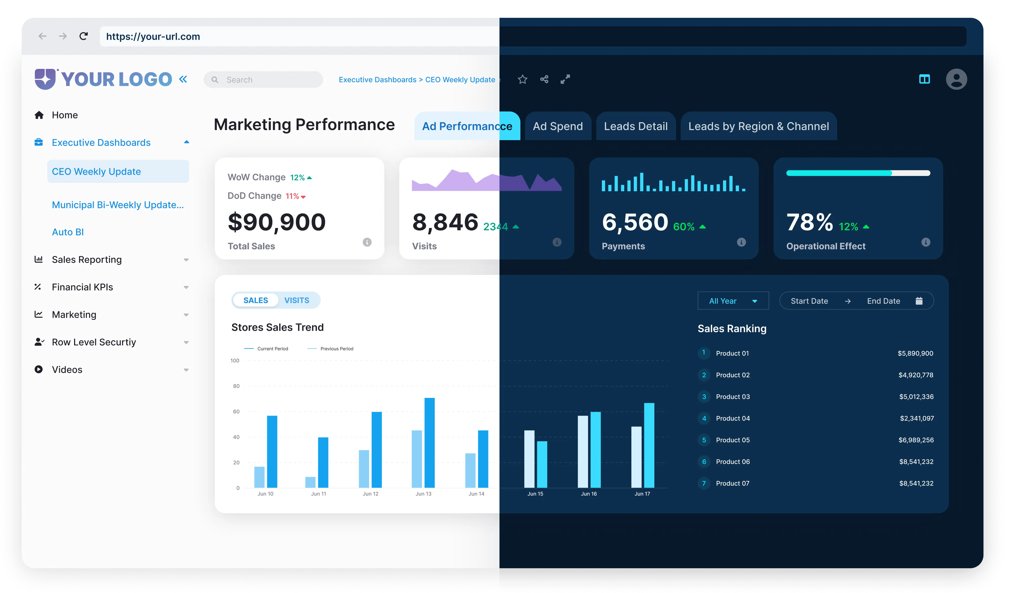
To productize Power BI means going beyond building dashboards. It’s about delivering data as a polished, scalable product, embedded into a custom-branded experience that looks and feels like your own application.
Instead of sharing static reports or scattered links, teams embed Power BI directly into client portals, web apps, or internal tools. This approach gives users access to live, interactive analytics right where they already work. And with the right setup, it’s secure, multi-tenant, and built for growth. Implement multi-tenancy using Power BI Embedded + RLS + workspace management. Each client’s data is filtered using RLS policies while using the same report.
Productizing Power BI typically includes:
It’s not just about aesthetics. These capabilities lead to real business outcomes: faster client onboarding, stronger engagement, and even new revenue streams through subscriptions or upsell models.

Packaging Drives Adoption. Adoption Drives ROI.
You can have the most accurate models, cleanest datasets, and smartest insights, but if the delivery falls short, none of it gets used. That’s the reality many analytics teams face: the work is solid, but the presentation gets overlooked. And without engagement, there’s no return.
Great data needs more than dashboards; it needs packaging. When analytics are delivered in a seamless, branded, and intuitive experience, users engage more. They explore. They trust the data. They use it to make decisions. That’s when analytics starts driving real outcomes and real ROI.
If you’re already investing time, tools, and people into building insights, don’t let that investment fall flat at the finish line. How you package and present Power BI isn’t just a detail; it’s the difference between underused dashboards and a true business asset.

From custom branding and secure access to Azure deployment and multi-tenant control, it’s all built in.
See how it works and start turning your analytics into a true growth engine.