Subscribe to our blog to stay up to date on all the latest information from the Reporting Hub team! We’ll never share your email with anyone else.
Design-first analytics puts users at the center of the reporting experience. It flips the script on traditional dashboards. Instead of designing after the data is built, it prioritizes user behavior, clarity, and usability from the outset.
This approach utilizes real data to dictate the methods of delivering insights. Every part of the layout, interactions, and visualizations is controlled, including how users interact with the dashboard, what they click on, how they navigate, and which areas they focus on or skip. This is not about jamming every metric into a dashboard; it is about ease of understanding, ease of flow, and usability.
The result? Dashboards and portals that don’t just look better, they perform better.
They’re easier to navigate, aligned with your client’s brand, and far more likely to be adopted and used.
Design-first analytics doesn’t mean design over data. It means better data experiences built on insight,
delivered with purpose, and packaged in a way that makes sense to real users.
What Is Design-First Analytics?
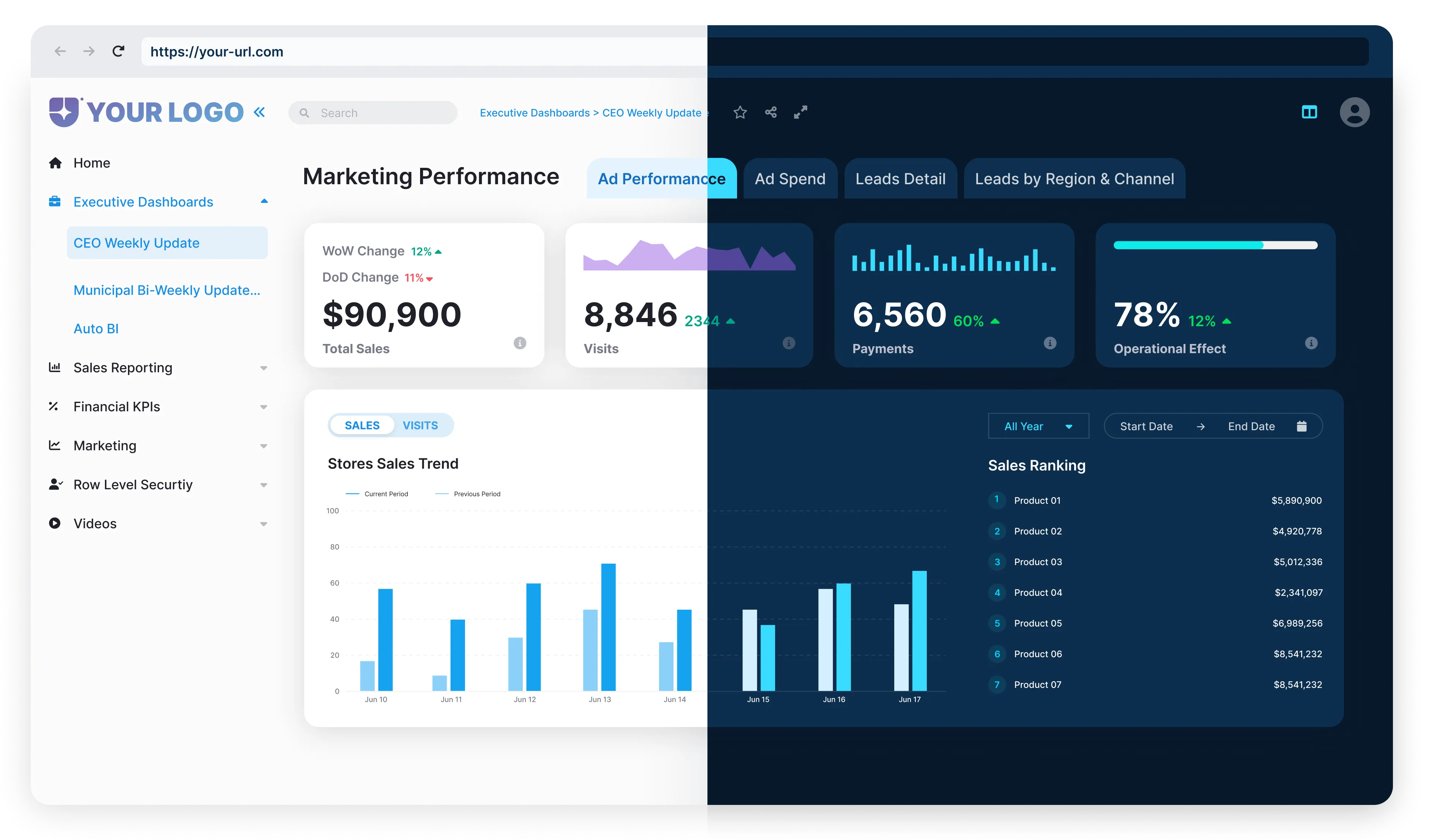
Design-first analytics is the process of focusing on a user’s experience, visual presentation, and branding in how data is delivered. It is not simply considering what data is valuable, but rather how your clients see that data and experience it through your reporting. Design-first analytics require you to think as a product designer would, considering not only clarity, but how and where information will be located, and to ensure you don’t forget the brand.
Dashboards are purposefully designed to ensure that your user can see what they need to see first, what actions they need to make, and how you can make that experience as effortless as possible.
Traditional “data-first” reports inundate users with charts, tables, and diagrams, all of which focus on completeness instead of usability. For example, dashboards filled with 20+ charts or unrelated KPIs without a clear narrative can confuse stakeholders. Clients in this situation don’t know what stories to uncover, feel overwhelmed, and don’t use the dashboards.
Design-first analytics fixes this.
Clients assess the value of analytics beyond the data provided, but also how easily it can be consumed, acted upon, and whether or not it can be trusted. From our perspective, this line of thinking is especially important for agencies, consultants, and productized analytics teams, who are delivering reporting daily. When clients can see their brand, their data, and have an overall clean experience tailored to their needs, we increase the perceived value of the service you provide.
As competition rises in your market, a clear branded experience to make your product or service easier to carry out is a differentiator of your service.
Why Design Matters in Analytics Delivery
Presentation informs perception in analytics. You can have the best data available, but if it’s hidden in a cluttered dashboard or hard-to-navigate reports, you won’t create action. This is why design is not fluff; it’s essential.
First impressions matter
Clients judge the worth of analytics by how it looks and feels. A clean, branded interface indicates professionalism instantly and builds trust. When users see their logo, their colors, and a clean layout, it provides some sense of ownership, and this drives engagement.
Clarity over complexity
Design-first analytics drives users toward the insights that matter. Smart layouts, intended navigation, and thoughtful visual hierarchy clear the noise and signal the important aspects. This allows data to be more easily understood, interpreted faster, and more likely to be used.
Design supports decision-making
Dashboards that are well structured can bring out trends and outliers in seconds. By reducing friction in how data is consumed, design supports users to act with confidence and act faster.
Not a one-size-fits-all
Good design customizes the experience to the audience. A sales leader should not see the same report as a technical analyst. Design for roles and context ensures every user gets what they need.
Better design leads to better outcomes
Design offers benefits in many ways: it leads to higher rates of adoption and quicker decisions. Design removes friction between insight and action, nurtures collaboration, and enables analytics teams to deliver more value to the business with less effort.
When BI is built with humans in mind, people don’t struggle. They engage. They explore. They make faster, better decisions. That’s the power of human-centered design. It turns dashboards into tools people want to use daily.
Common UX Mistakes That Push Clients Away
Even with the most sophisticated analytics platform in the world, a bad user experience will prevent success. Here are some common UX mistakes that drive clients away, and learn how to avoid them when delivering branded Power BI portals at scale:
1
Default Power BI UI with no white labeling
Sending reports that show the default Power BI interface (blue headers, Power BI logos, and generic layout) can show a general lack of polish. Clients are seeing Microsoft’s branding instead of their own branding, which undermines the value of your service.
Fix: Create a white label version to match every client’s brand identity. This builds trust between them and the platform, and gives users more of a sense of ownership over the analytics platform.
2
Cluttered or inconsistent layouts
Dashboards overloaded with charts, filters, and mismatched styles confuse users and reduce confidence in the analytics narrative.
Fix: Design layouts with hierarchy and simplicity. Keep components consistent and draw attention to the most important metrics first.
3
Difficult-to-Navigate Dashboards with No Context
Dashboards without context, labels, or guidance force users to guess what matters, leading to disengagement.
Fix: Include tooltips, headings, and explanatory text. Organize insights logically and provide a clear navigation path.
4
One-Size-Fits-All Design
Showing the same dashboard to every user leads to irrelevant information and cognitive overload.
Fix: Differentiate dashboards by role and persona goals using tailored Power BI views.
5
Ignoring Mobile Experience
Non-responsive dashboards break down on smaller screens, forcing excessive scrolling or abandonment.
Fix: Optimize layouts for mobile. Responsive design is not optional — it’s an expectation.
Analytics delivery with a design-first approach isn’t just about being flashy; it’s about eliminating friction. When clients can easily browse, comprehend, and enact insights, they will use your platform more and recommend it.
Common UX Mistakes That Push Clients Away
Key Elements of a Design-First Analytics Experience
Here is what makes a design-first delivery different:
Branded Portals
Clients want a branded experience that promotes their brand. This means custom domains, logos, colors, and styling that align with their identity.
Why it matters: Branding builds trust. When users enter their own environment versus a generic one, they are more inclined to appreciate and accept the solution.
Embedded, Responsive Dashboards
Dashboards should feel embedded in the client’s app or portal, not like a third-party component. Furthermore, they must respond to any device: desktop, tablet, and mobile.
Why it matters: A responsive experience that feels embedded, improves usability, and promotes insight anytime, anywhere your users work.
Role-Based Navigation and Structure
Different users have different needs for insights. Executives might want high-level KPIs. Operators need detail and real-time data. There is no standard dashboard for everyone.
Why it matters: Designing dashboards around user roles provides a better experience, creates less noise, and ensures that users only see what is appropriate for them.
Speed and performance
No one wants to wait 10 seconds for a report to load. Design-first analytics must meet a modern definition of web speed: fast load, good transitions, fast and responsive, with minimal load delays.
Why it matters: Speed matters because it influences perception. A fast, fluid interface feels professional and makes it easy to come back.
Clear Information Design
Charts, tables, and visuals should inform the story, not block the story. Good design means leading a user through insights using structure, color, and context, not drowning them in data.
Why it matters: Good layout and visual hierarchy mean users can interpret data quickly and confidently.
Accessible and Inclusive UX
Analytics should comply with accessibility standards (such as WCAG), ensuring usability for all users, including those with disabilities. This includes readable fonts, keyboard navigation, alt text, and proper contrast.
Why it matters: Inclusive design extends your reach and shows professionalism and care in delivery.
Continuous Iteration Based on Feedback
Design-first doesn’t stop at launch. It includes testing, collecting feedback, and refining dashboards until usability builds over time.
Why it matters: Actual usage will tell how usable, or ineffective, your offering is. Iteration will ensure your analytics stay relevant and are easy for users to use.
How Reporting Hub Enables Design-First Delivery
Design-first analytics needs more than just clean visuals. It needs a platform that puts user experience, flexibility, and branding at the core. That’s exactly what Reporting Hub delivers. It’s a fully white-labeled, no-code solution built on Power BI Embedded, designed to help you scale analytics without custom development.
You can brand the entire experience – logos, themes, color schemes, and even the domain – so every client receives a best-in-class portal that looks and feels like theirs.
Each client or user group can be separated into its own multi-tenant environments to give you the ability to group clients by role-based access and securely deliver content to them. That means you can customize dashboards and reports without starting from scratch each time.
Reporting Hub also provides you with freedom about where and how you deploy.
You can embed dashboards using iframe or JavaScript SDK, backed by Azure AD authentication, run dashboards as a standalone portal, or host dashboards on your own domain – all out of the box.
You’ll be able to get to market quickly and won’t be spending months to launch the application.
Reporting Hub is a plug-and-play platform that deploys to your Azure environment in minutes, giving you full control over theming, access, and user management.
For teams delivering analytics at scale, it’s a smarter way to deliver beautiful, branded, and user-friendly reporting experiences without the usual technical overhead.