Illustration of two people analyzing charts and data visualizations, one holding a magnifying glass and the other pointing at a chart.

Human-Centered Design for Embedded BI Portals

Smiling man with short dark hair wearing a dark shirt against a blue gradient background.
Brian DeLuca
Brian DeLuca is a co-founder and CEO of The Reporting Hub. As a seasoned expert in data, analytics, and business intelligence, Brian brings over 20 years of experience driving innovation and organizat...
Clock
5 Minutes
Subscribe to our blog to stay up to date on all the latest information from the Reporting Hub team! We’ll never share your email with anyone else.
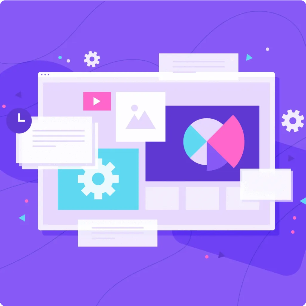
When done right, an embedded BI portal should feel like a natural extension of your product, though this depends on your tech stack and user needs. For example, real-time data workflows may require more customization than static reports. However, many dashboards still feel like they were built for analysts, rather than for real users trying to answer questions quickly. That’s where human-centered design comes in.

In this post, we’ll explore what it means to design embedded BI portals with people in mind, and how you can use these principles to boost adoption, clarity, and long-term value.

What Is Human-Centered Design in BI?

Human-centered design is all about creating tools that are truly useful by focusing on the people who use them. It means understanding their goals, the decisions they need to make, and the actions they want to take.

In BI, that goes beyond just showing charts. It’s about designing a comprehensive experience that supports the entire decision cycle, from identifying trends to testing hypotheses and taking action. That might mean telling a clear story with the data, or building features right into the dashboard that let users respond in real-time.
For teams tired of clunky workarounds and copy-pasting data, Power BI is a major upgrade.
Colorful circular icon with a chat window showing pink and yellow speech bubbles above a bar chart with an upward arrow.
Dashboards that guide users, not overwhelm them
Colorful circular icon with a chat window showing pink and yellow speech bubbles above a bar chart with an upward arrow.
Navigation that feels intuitive, not frustrating
Colorful circular icon with a chat window showing pink and yellow speech bubbles above a bar chart with an upward arrow.
Design choices that reflect real usage patterns, not just data logic
For example, if the request is to display distributor sales and current inventory, it might seem like a standard dashboard will suffice. But once you understand how users will interact with the data, you may find they need more than visibility; they need to make decisions directly from the insights.

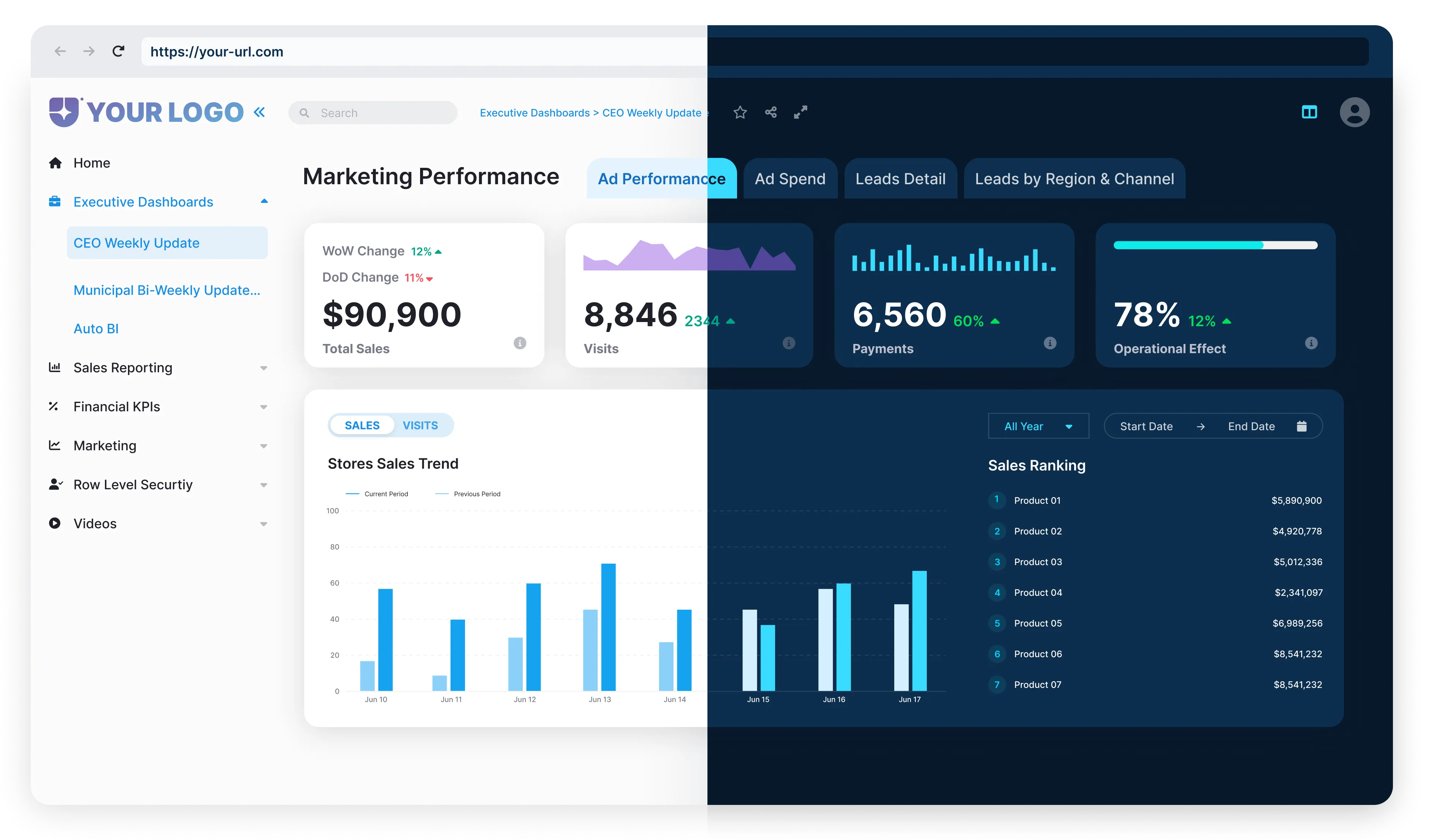
With Reporting Hub, you can design an embedded BI experience that brings those insights closer to action. Users can explore trends, plan purchases, and monitor performance, all within a single, intuitive interface. It’s about turning dashboards into tools people use to move work forward.
HCD doesn’t ignore the technical power of your BI portal. It simply ensures that power is accessible to those who need it, without requiring a PhD in data science.
Illustration of three people interacting with colorful bar graphs, pie charts, and data visualizations representing business intelligence and analytics.

What Is Human-Centered Design in BI?

Designing for usability often takes a backseat to getting the data and visuals right. But poor user experience can break even the most technically advanced dashboards.
Common issues include:
Blue circular icon with four lighter blue squares arranged in a grid pattern.
Cluttered Layouts
Overwhelming users with too many visuals, filters, or KPIs on a single page.
Blue circular icon with four lighter blue squares arranged in a grid pattern.
Confusing Navigation
Users don’t know where to start, what a filter controls, or how to drill down.
Blue circular icon with a minimalist smartphone outline in the center.
Lack of Mobile Responsiveness
Embedded BI portals that aren’t designed for mobile lose relevance in fast-paced, on-the-go use cases.
Blue circular icon with a shield shape in the center.
No Support for Self-Service
While self-service BI boosts adoption, it requires guardrails, like curated datasets and tooltips, to prevent misanalysis and ensure ROI.
The Reporting Hub’s Power BI dashboards address these challenges directly. It offers clean, intuitive layouts with only the most relevant visuals. Simple navigation ensures users know exactly where to start and how to explore data. It’s mobile-responsive, so users can engage with dashboards from anywhere. With self-service tools, users can explore, customize, and gain insights on their own, boosting adoption and ROI.

Principles of Human-Centered Design for BI Portals

Even the best dashboards fail when usability is ignored. Design is often an afterthought. But if users struggle to navigate, the dashboard fails, no matter how good the data looks.
Clarity Over Complexity
Dashboards often fall into the trap of over-communication. Every stakeholder wants their metric on the homepage, and every team wants their chart front and center.

But showing everything at once only leads to noise. Human-centered design means focusing on what matters most in the moment. Prioritize essential KPIs. Use techniques like progressive disclosure to reveal additional data only when it’s needed.

This also respects how users naturally process information, one decision at a time.
Intuitive Navigation
If users don’t know where to click or what controls what, they’ll leave—or worse, make the wrong decision.

Group related visuals together to create a natural flow. Filters should behave consistently and predictably across pages. Clear headers, descriptive subtext, and hover states help users stay oriented. It should always be obvious what they’re looking at, what it means, and how to explore deeper.

Think of navigation as a conversation, not a puzzle.
Mobile-First and Accessible
Your users aren’t all sitting at desks. They’re on factory floors, in meetings, or commuting.

For users on the go (e.g., sales teams, execs), mobile-friendly design is essential. Audit your users’ primary devices before prioritizing this.. The same goes for accessibility. Use proper color contrast, readable fonts, and keyboard-friendly layouts.

Designing for smaller screens and assistive technologies shows you care about making data usable for everyone, everywhere.
Embedded Help and Feedback Loops
No one likes being dropped into a dashboard without context. Help users get oriented with in-line explanations, onboarding tooltips, and embedded help buttons.

Just as important: show them the result of their actions. If a user applies a filter, updates the labels, or adds a toast notification, they know something changed.

Feedback loops build confidence, and confidence drives adoption.
Three people collaborating on technology ideas with a large light bulb and gears symbolizing innovation and teamwork.

What Human-Centered BI Looks Like

Here’s what BI looks like when it’s built around the user.
Pink circular icon with a simplified human figure and a smaller rectangle suggesting user-centered design concept.
Cluttered Layouts
Right away, they see what features users are adopting, which ones are lagging, and how that ties to churn. There’s no need to scroll through endless tabs or guess which chart matters. The insights are front and center. Simple. Actionable.
Pink circular icon with a stylized letter H and C intertwined, representing human-centered design.
A store manager at a national retail chain compares performance across five locations.
With a few clicks, they spot which store is underperforming and why staffing levels, inventory issues, and foot traffic. No training. No help needed. The dashboard guides them like a conversation.
Icon showing three interconnected gears inside a pink circular background, representing human-centered design.
In HR, an internal portal filters the noise.
A recruiter sees open roles and applicant funnels. A benefits manager sees plan usage and engagement. A team lead sees PTO trends and burnout signals. Each view is tailored by role. Alerts and prompts nudge action without users needing to ask, “What next?”
When BI is built with humans in mind, people don’t struggle. They engage. They explore. They make faster, better decisions. That’s the power of human-centered design. It turns dashboards into tools people want to use daily.

What Human-Centered BI Looks Like

We built Reporting Hub to make it easy for teams to deliver embedded BI portals that feel seamless, smart, and purpose-built, Reporting Hub includes features like role-based views and white-label customization, which help teams align BI portals with user needs but success depends on iterative testing with your audience, with the full power of Power BI Embedded behind them.
Blue circular icon with a white window-like grid symbol inside.
Pre-built layouts and role-based views reduce noise for different users.
Blue circular icon with a checkmark inside.
White label customization means your portal looks and feels like part of your product.
Blue circular icon with a shield shape in the center.
Embedded Power BI technology ensures performance, interactivity, and security.
Blue circular icon with a cloud shape in the center representing cloud computing or cloud storage.
Deployed on Azure, giving you full control over where and how your BI experience is hosted.
Whether you’re building for customers, partners, or internal teams, Reporting Hub gives you the foundation to design better and faster.
Illustration of a computer screen displaying various interface elements including a pie chart, gear icons, a play button, and text boxes on a purple background.

Build a Better Embedded BI Portal

A great BI experience isn’t about how much data you can show; it’s about how easily your users can act on it.
With Reporting Hub, you can build embedded BI portals that are both powerful and personal.

Ready to see it in action?
Get started today