Power BI Product Performance Dashboard - Connect Usage Data to Revenue Outcomes

A Power BI product performance dashboard brings your product, customer, and revenue data into a single, structured view. Instead of piecing together insights from multiple tools, you get a clear picture of how your product is actually performing.

With continuously updated data and configurable views, you can identify what drives engagement, retention, and revenue and make faster, more confident decisions.

Smiling man with short dark hair wearing a dark shirt against a blue gradient background.
Brian DeLuca
11 min read . July 2025
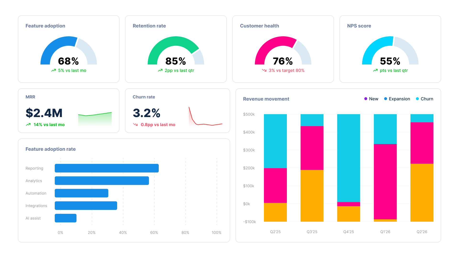
Power BI product performance dashboard showing feature adoption, retention rate, MRR and revenue movement
WHAT BECOMES POSSIBLE WHEN YOUR PRODUCT DATA TELLS A COMPLETE STORY

Meaningful product insight rarely lives in one tool. It comes from how your data connects.

Usage tied to retention. Pricing linked to expansion. Acquisition connected to long-term engagement. Reporting Hub brings these relationships into a familiar Power BI environment. Your team can filter segments, compare cohorts, and track metrics over time without relying on static reports. The data stays current, interactive, and available whenever decisions need to be made.

Icon
Product Teams: What is actually working?
Product managers need to know if what they build is being used and whether it affects key metrics. They must identify where the experience creates friction before it compounds. The dashboard closes the loop between output and outcome. Roadmap discussions are grounded in evidence, not just advocacy.
Icon
Commercial and Sales Teams: Where is the next opportunity?
Expansion revenue does not need a new pipeline if you can see it forming within your current customer base. Accounts showing growth in usage, seat count, or feature engagement become natural starting points for upsell and renewal conversations. These discussions are based on actual customer activity, not just what was discussed in the last quarterly business review.
Icon
Customer Success Teams: Where is the risk forming?
Teams that consistently reduce churn are the ones that recognize engagement signals while there is still time to act. Drops in usage, feature regression, and plateaus in product activity are all visible in the dashboard. They surface before customers express any concerns and well before they consider leaving.
Icon
Marketing Teams: Which channels produce customers worth keeping?
Focusing solely on acquisition without understanding downstream product engagement leads companies to spend heavily and retain poorly. The dashboard links channel and campaign data to long-term usage and retention outcomes. Marketing gains the insights it needs to refine targeting and allocate spending effectively.
Icon
Leadership and Finance: Is the product driving the business forward?
Executives want a summary of revenue by segment, retention trends, and the contribution of product-led growth. The dashboard provides that view without needing a report request. Detailed information is available when context is needed, which is useful ahead of board meetings, investor updates, or annual planning cycles.
Icon
No New Platform. No Migration.
There is no new platform to adopt, no parallel system to maintain, and no migration to complete before you can see anything useful. Reporting Hub is built on the Power BI infrastructure your team already runs. Setup is fast. The learning curve is flat. Get a Free Trial

Power BI Dashboards Covering the Full Span of Product Performance

Each dashboard focuses on a specific decision area. Together, they give product, commercial, and executive teams a consistent view of how the product is performing in every aspect that ties to revenue.

Feature Adoption Dashboard
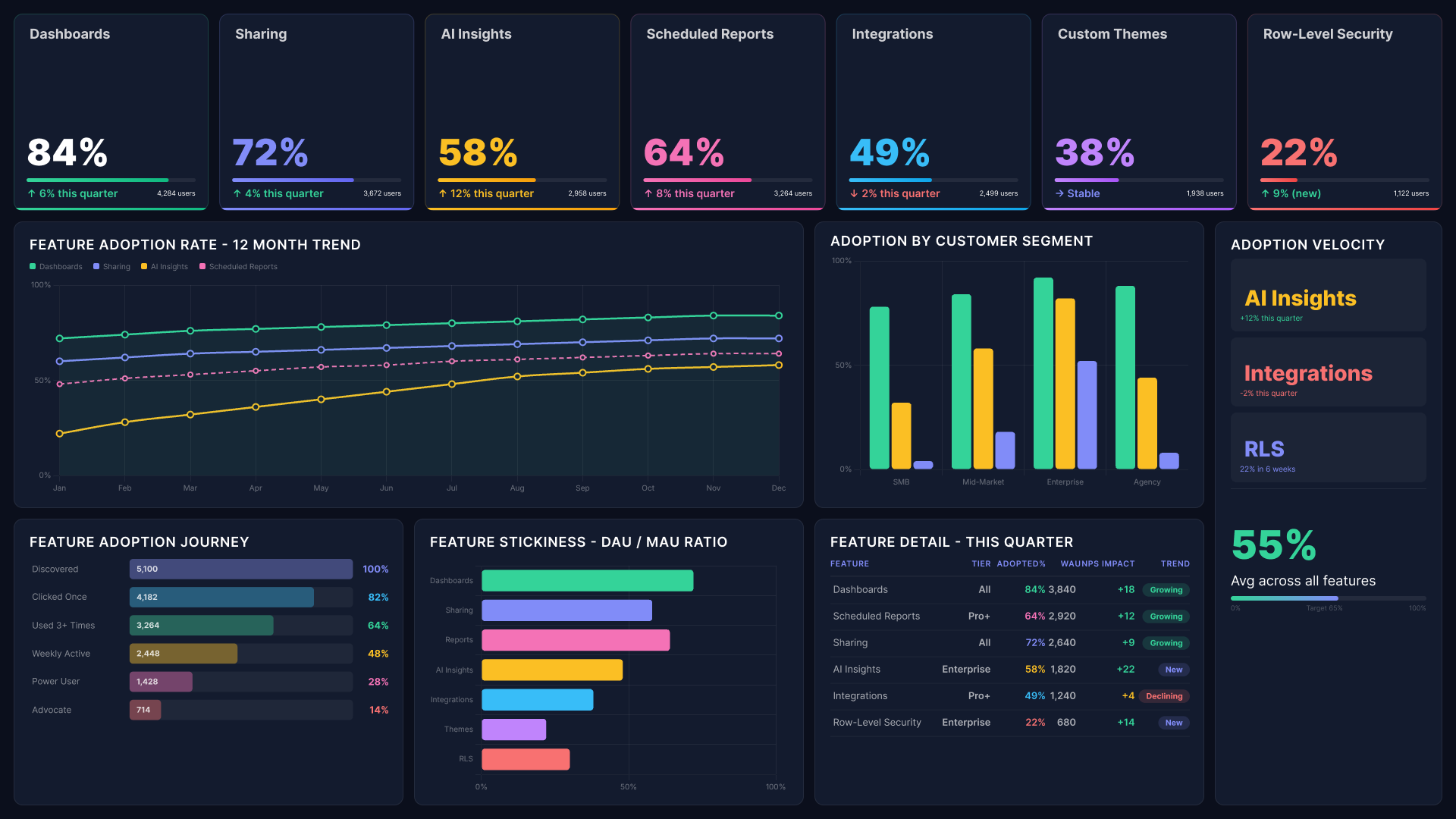
Power BI product performance dashboard showing feature adoption rates, stickiness and adoption journey by segment
Track which features are being used, by which segments, and how often. Break it down by tier, group, or customer profile. Understand what drives engagement in your most valuable accounts and what gets overlooked despite the investment in building it.
Abstract background with a diagonal split between light blue and dark navy blue colors.

Revenue and Monetisation Dashboard

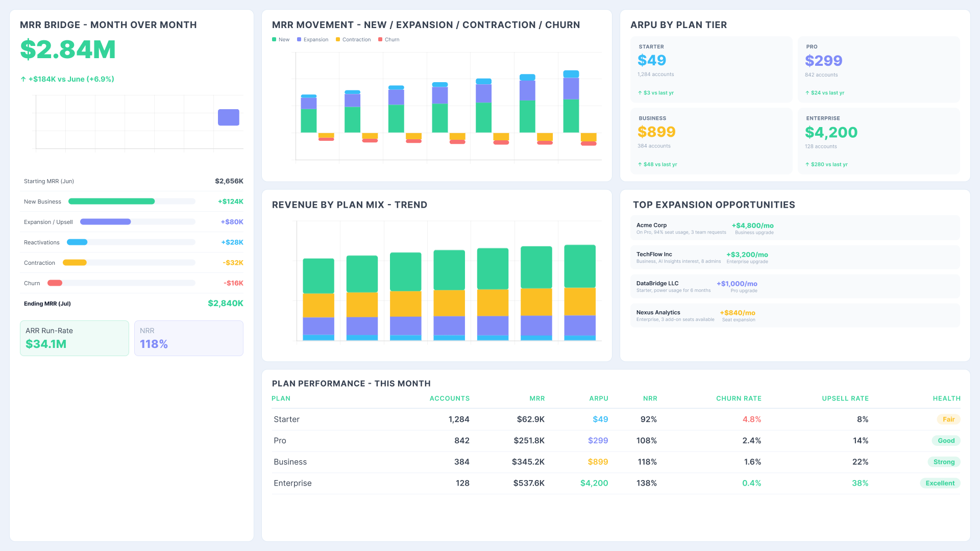
Power BI product performance dashboard showing MRR bridge, revenue by plan mix and expansion opportunities
Link product usage directly to billing outcomes across tiers, pricing plans, and customer segments. Bring product and finance teams together around the same figures. Pricing decisions, packaging changes, and expansion discussions are all based on actual revenue contributions rather than assumptions.

Product Retention Dashboard

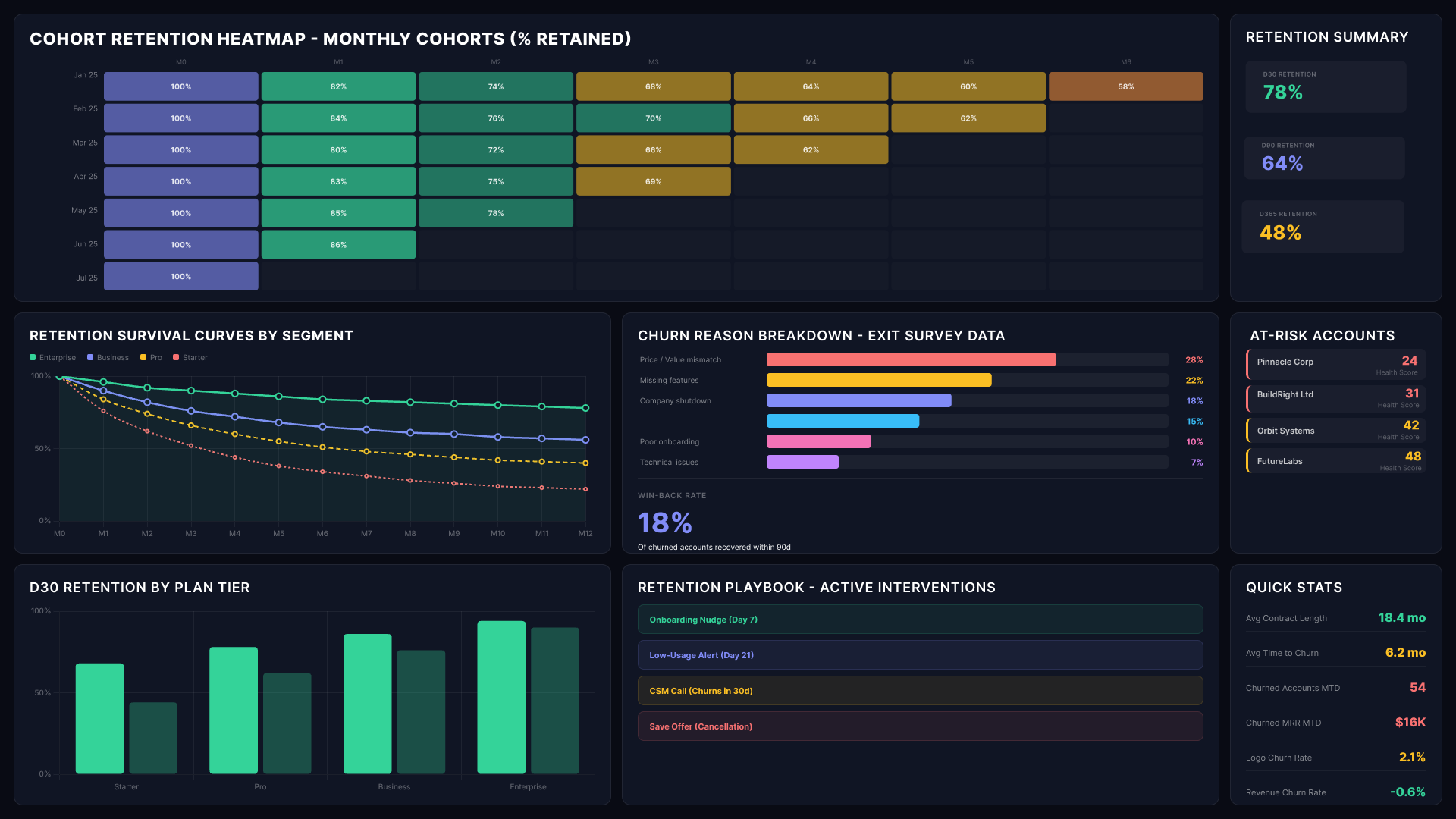
Power BI product performance dashboard showing cohort retention heatmap, churn reasons and at-risk accounts
Understand where in the customer lifecycle engagement drops and when the decline typically begins. See which usage patterns are common in the accounts that retain the longest. Provide product and customer success teams with a shared real-time view of the signals that predict renewal long before the renewal conversation is lost.
Abstract background with a diagonal split between light blue and dark navy blue colors.

Customer Health and Expansion Dashboard
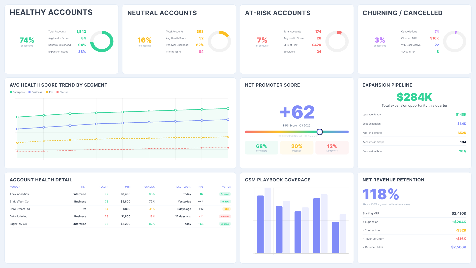
Power BI product performance dashboard showing customer health scores, NPS, expansion pipeline and account detail
Identify accounts that are growing in usage, team size, or feature breadth. Highlight those that are declining before they decide to churn. Turn product behavior into a live expansion pipeline that your commercial team can confidently work from.

Roadmap Impact Dashboard

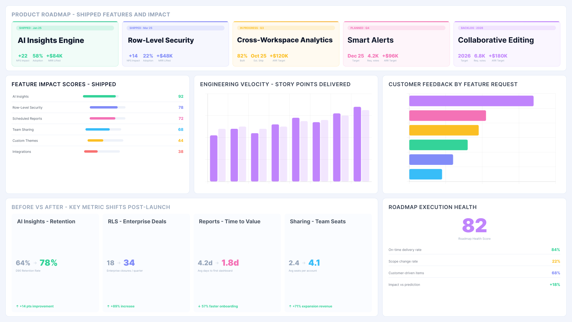
Power BI product performance dashboard showing roadmap shipped features, engineering velocity and before vs after metric shifts
Measure what happens after a product release. Track adoption curves, engagement changes, and retention shifts following each launch cycle. Understand which investments positively impacted the metrics and which had no measurable effect. Prioritization decisions are based on evidence from the start.
Abstract background with a diagonal split between light blue and dark navy blue colors.

Performance Benchmarking Dashboard

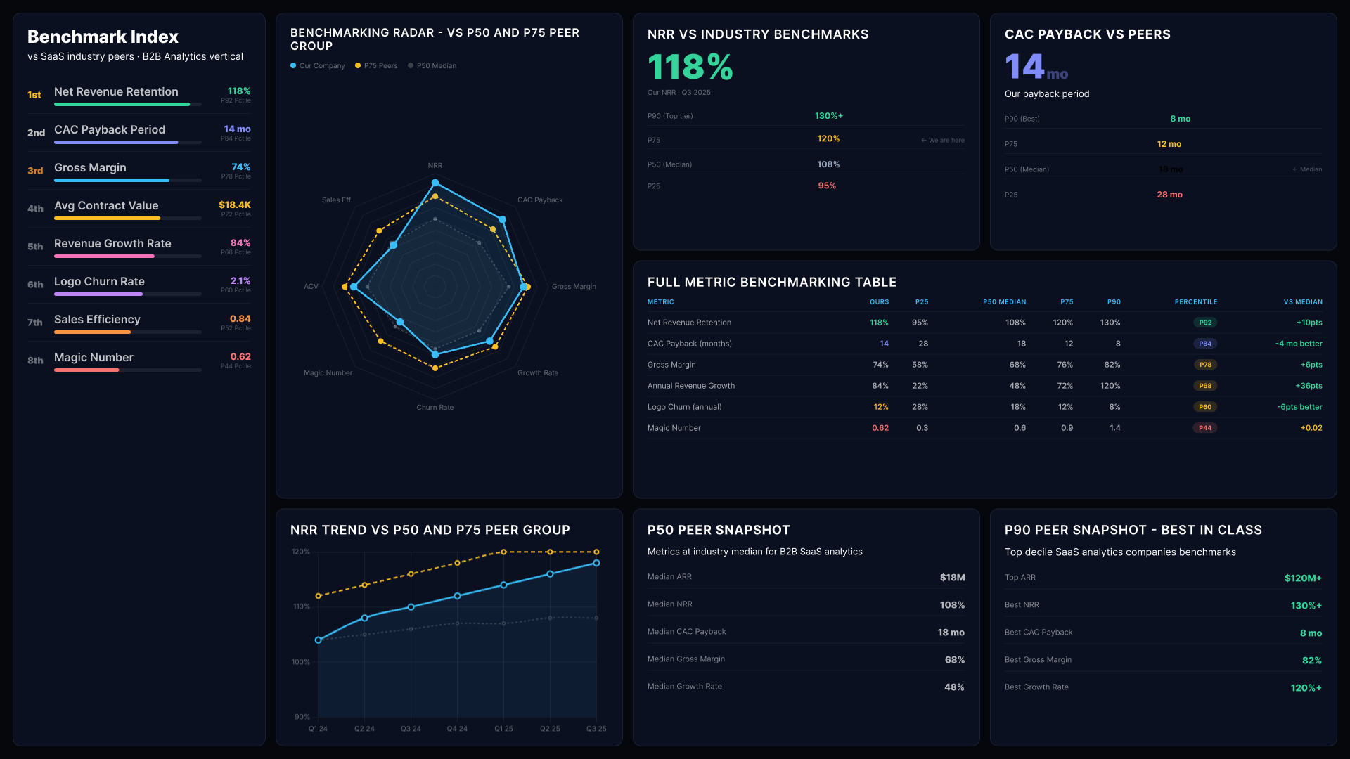
Power BI product performance dashboard showing benchmarking radar, NRR vs industry benchmarks and full metric table
Compare product performance across tiers, regions, or customer segments side by side. Identify what your highest-performing cohorts share. Use those patterns to enhance acquisition targeting, onboarding design, and customer development strategies.
Access is controlled at the user level. Row-level security ensures each person sees exactly what they are permitted to see. The governance layer is built in, not bolted on.

Product Performance Dashboard FAQs

Can the dashboard track performance across multiple products or product lines?

Yes. It unifies product data. Teams filter by product while keeping full portfolio visibility.

How is product usage data kept secure when shared across teams or with external stakeholders?

Row-level security and access controls ensure each user only sees permitted data. Sensitive usage data stays protected.

Can we customize which metrics appear for different teams or external clients?

Yes. Tailor metrics, layout, and detail level for each audience, from product teams to executive summaries.

Does it work if our product data sits across multiple platforms or databases?

Yes. It connects multiple sources and works with existing Power BI models without needing a new warehouse.

Can we set up alerts when a key product metric changes significantly?

Yes. Configure alerts for drops, thresholds, or anomalies. Teams get notified instantly to act quickly.