Power BI Operational Efficiency Dashboard - Optimize Business Processes

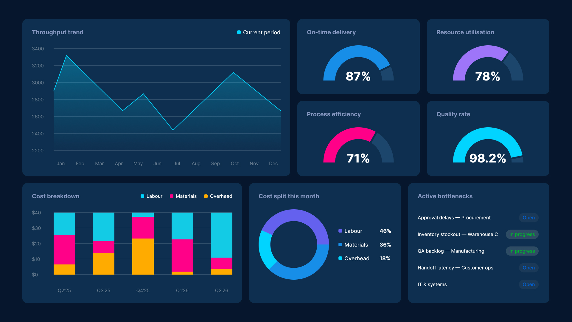
A Power BI operational efficiency dashboard connects your process, cost, workforce, and vendor data into one real-time view. Instead of chasing reports from different systems, operations teams get a live picture of what is happening across the business and where it needs attention.

Most operational inefficiency is not caused by a lack of data. It is caused by data that arrives too late, sits in the wrong system, or cannot be connected to anything else. This dashboard fixes that.

Smiling man with short dark hair wearing a dark shirt against a blue gradient background.
Brian DeLuca
11 min read . July 2025
Power BI operational efficiency dashboard showing throughput, process efficiency, cost breakdown and active bottlenecks
THE OPERATIONAL DATA PROBLEM MOST BUSINESSES HAVE

Most operational inefficiency is not caused by a lack of data. It is caused by data that arrives too late.

Operations teams rarely have a single view of what is happening across the business. Process performance data lives in one system. Cost data lives in another. Workforce metrics are in a third. Vendor information is in a spreadsheet. By the time anyone connects these sources into a report, the moment to act has already passed.

Icon
Process Performance
Cycle time, throughput, and on-time delivery rates tracked in real time. See which processes are running efficiently and which are creating delay and cost before they cascade downstream.
Icon
Resource Utilisation
Workforce capacity, equipment availability, and facility usage in one view. Understand where resources are being over-stretched and where there is idle time that could be redirected.
Icon
Cost and Efficiency
Operational cost connected to process and team activity. See not just where money is going but which operational activity is driving it. Budget conversations become easier when the cause of cost variance is visible.
Icon
Quality and Compliance
Error rates, defect trends, and compliance metrics tracked continuously. Problems are visible while they are still fixable, not when a batch has already failed or an audit has already started.
Icon
Project and Delivery
Timeline, milestone, and delivery status across the portfolio. Delay patterns are identified before they repeat. At-risk projects are surfaced in time for intervention, not after the deadline has passed.
Icon
Vendor and Partner Performance
SLA compliance, delivery accuracy, and response times measured consistently across all external partners. Supplier variability that creates downstream operational risk becomes visible and manageable.

What Power BI Operational Dashboards Cover

Each view focuses on a specific operational decision area. Together they give operations, finance, and leadership a consistent, always-current picture of how the business is running.

Process Performance Dashboard
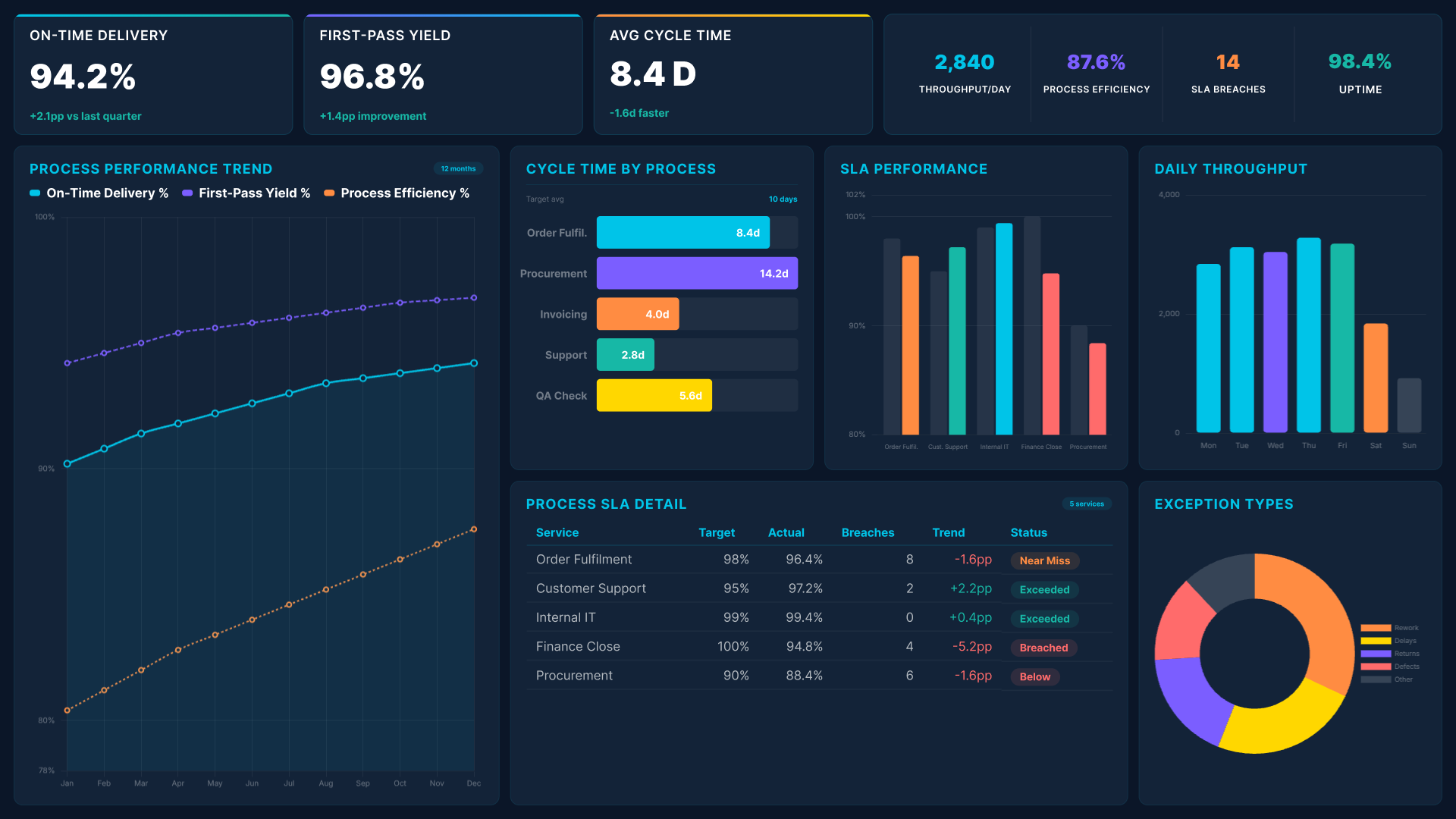
Power BI operational efficiency dashboard showing process performance trend, cycle time and SLA performance
Monitor cycle times, throughput, SLA performance, and on-time delivery across all core processes. See which processes are running to target and which are introducing delay or cost that compounds over time.
Abstract background with a diagonal split between light blue and dark navy blue colors.

Resource Utilisation Dashboard

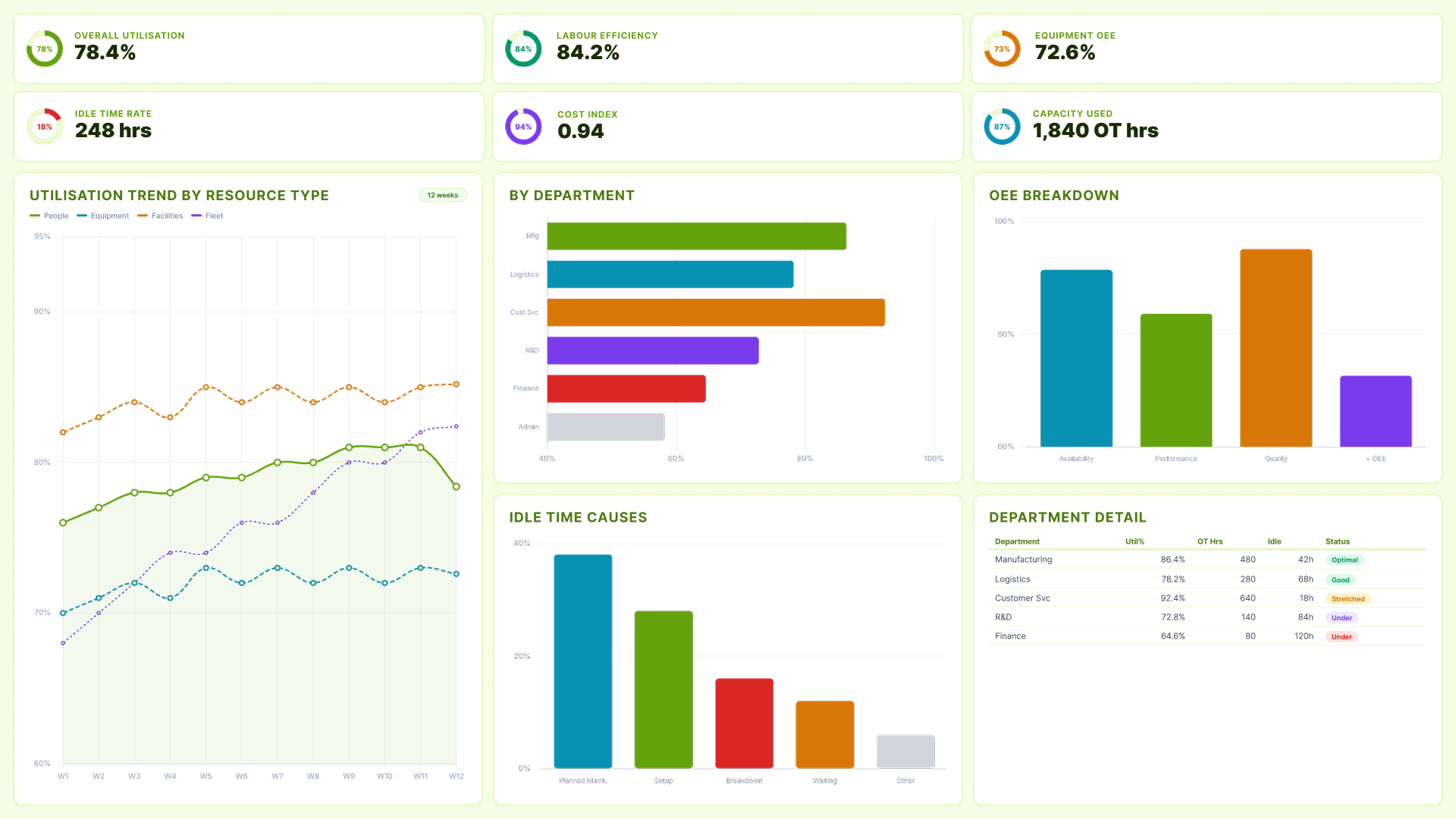
Power BI operational efficiency dashboard showing resource utilisation by department, OEE breakdown and idle time causes
Track workforce capacity, equipment OEE, and facility usage across departments. Understand where resources are over-stretched and where there is idle capacity that could be redirected to higher-value activity.

Cost Efficiency Dashboard

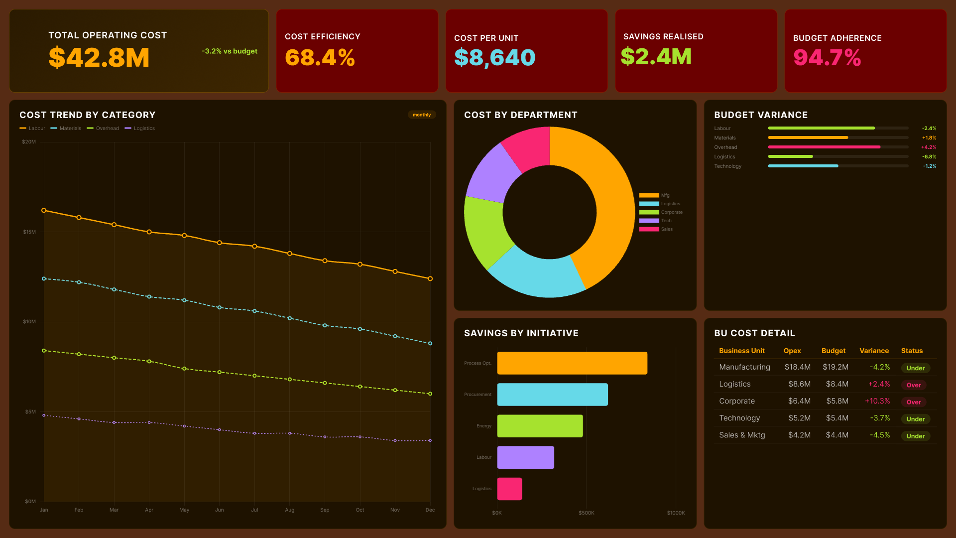
Power BI operational efficiency dashboard showing total operating cost, cost trend by category and savings by initiative
Connect operational cost to the activity driving it. See cost by category, department, and business unit against budget. Identify where savings initiatives are delivering results and where cost variance is outpacing what the budget assumed.
Abstract background with a diagonal split between light blue and dark navy blue colors.

Project Delivery Dashboard

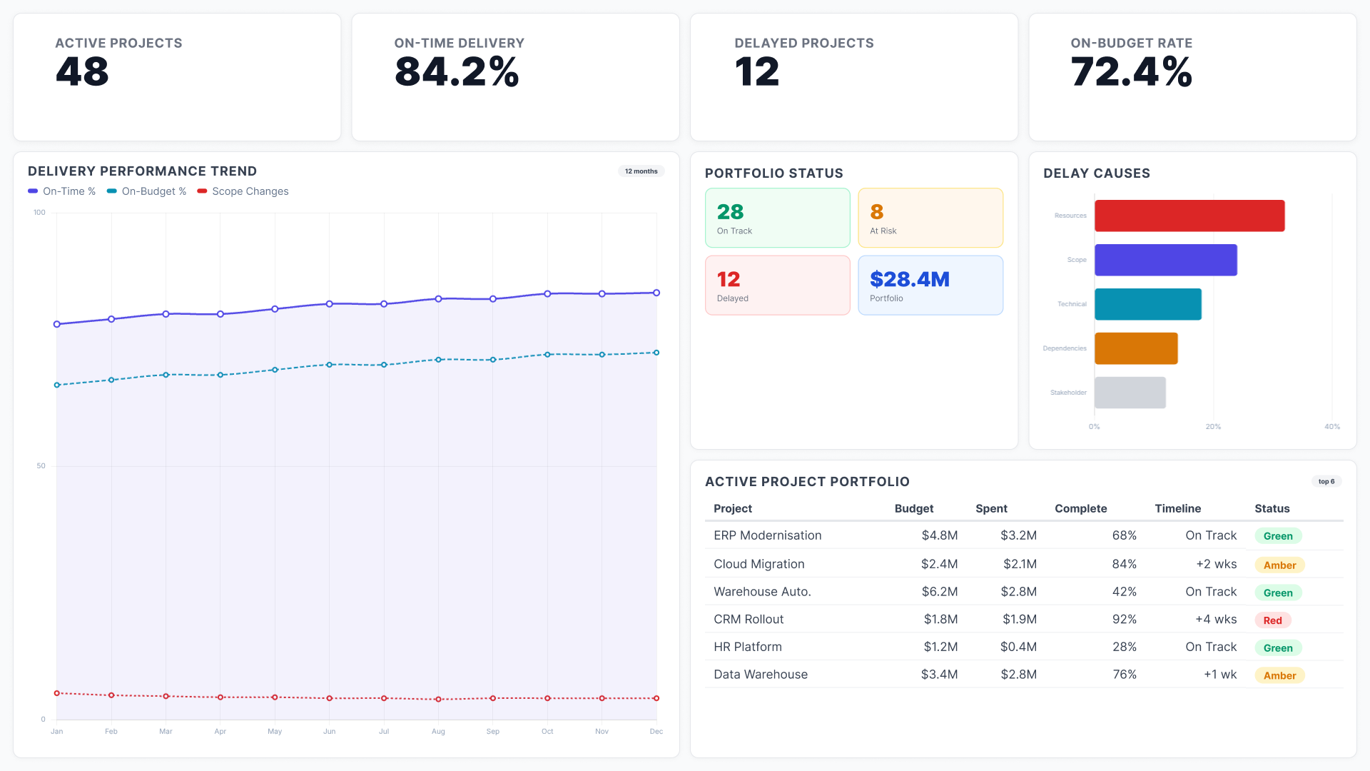
Power BI operational efficiency dashboard showing delivery performance trend, portfolio status and active project portfolio
Track timelines, milestones, and delivery status across the full project portfolio. See which projects are on track, at risk, or delayed. Identify repeated delay patterns before they become the default expectation.

Quality and Compliance Dashboard

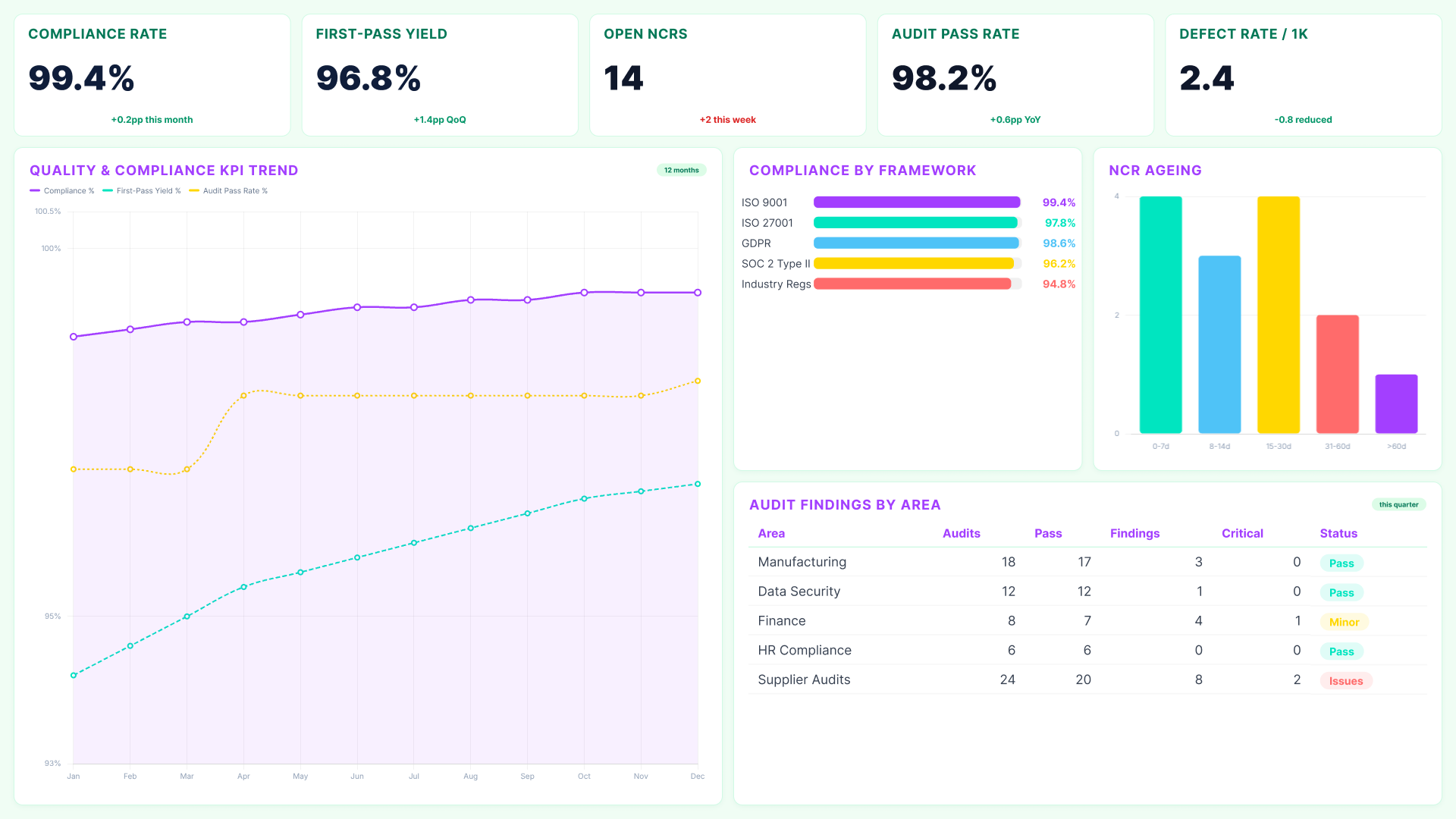
Power BI operational efficiency dashboard showing compliance rate, first-pass yield, audit findings and compliance by framework
Monitor error rates and defect trends in real time. Link issues to teams, processes, or time periods. Track compliance against regulatory frameworks continuously so you catch problems before they escalate into audit findings.
Abstract background with a diagonal split between light blue and dark navy blue colors.

Workforce Productivity Dashboard

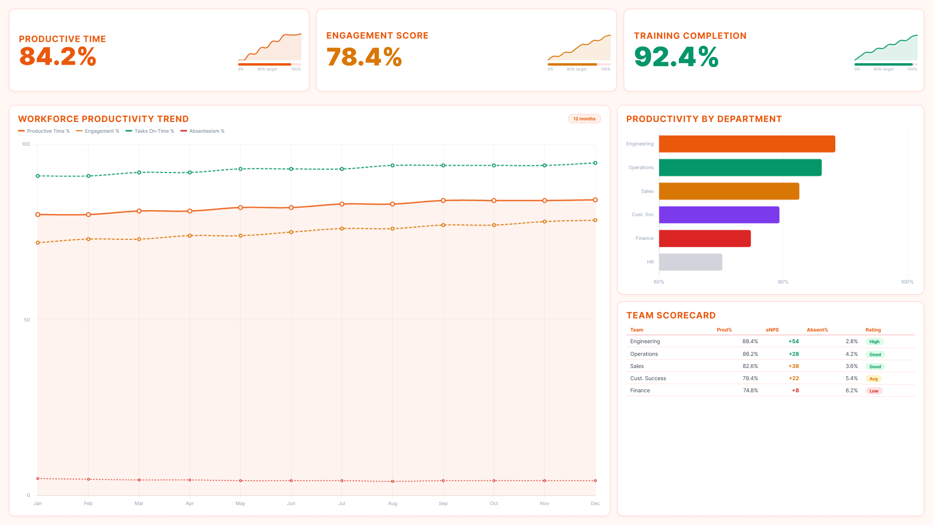
Power BI operational efficiency dashboard showing workforce productivity trend, productivity by department and team scorecard
Track output per team and per employee over time. Monitor productive time, engagement, training completion, and absenteeism in one view. Identify where performance is improving and where it is declining before it shows up as a delivery or quality problem.

Vendor and Partner Performance Dashboard
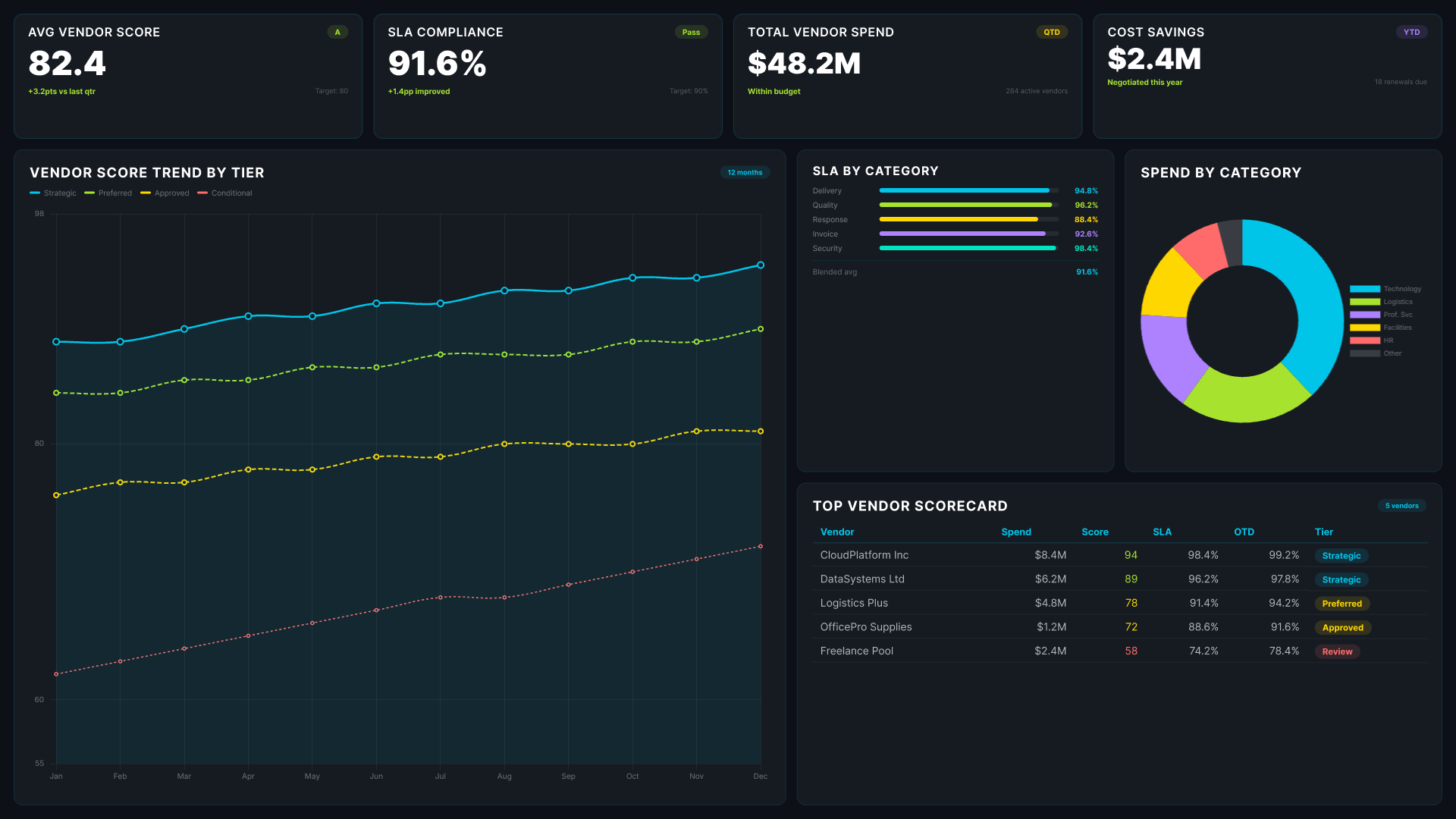
Power BI operational efficiency dashboard showing vendor score trend, SLA compliance by category and top vendor scorecard
Measure vendor performance against SLAs. Track delivery accuracy, response times, and compliance across all external partners. See which relationships are performing and which are introducing variability that shows up as cost or service failure downstream.
WHO USES AN OPERATIONAL EFFICIENCY DASHBOARD AND WHAT THEY NEED FROM IT

How Reporting Hub connects your operational data in Power BI

Reporting Hub is an AI-native intelligence orchestration platform built on Power BI. It connects your existing operational data sources into a governed, scalable dashboard environment without requiring a new infrastructure build or a parallel reporting system. There is no data migration to plan. Reporting Hub works with the Power BI environment and semantic models your organisation already has.

Icon
Operations Teams
Operations managers need to know where problems start, which teams and systems are involved, and whether the issue is isolated or recurring. The dashboard provides this level of detail in real time. It allows teams to act before outcomes are fixed.
Icon
Finance Teams
Finance teams can see when costs increase. They often cannot see the reason behind it. The dashboard connects spend to operational activity. It shows cost and process performance in the same view. This makes the cause of overspending clear.
Icon
Leadership
Executives need a simple view of operational health. They do not have time to review multiple reports with different metrics. The dashboard provides a single, consistent summary. It also allows deeper analysis when more context is needed.
Icon
Procurement and Supply Chain Teams
Supplier and vendor performance data is often managed in spreadsheets or separate systems no one else can access. The dashboard makes it visible and comparable. Teams can see which relationships are performing and which are introducing variability that shows up as cost or service failure downstream.
Icon
Project and Delivery Teams
Delivery teams benefit most from visibility while there is still time to course-correct. The dashboard surfaces milestone risk, resource conflicts, and delay patterns across the portfolio in real time.
Icon
No New Infrastructure Required
There is no new platform to adopt and no migration to complete. Reporting Hub is built on the Power BI infrastructure your team already runs. Setup is fast. Get a Free Trial

Operational Efficiency Dashboard FAQs

What is a Power BI operational efficiency dashboard?

A real-time analytics dashboard that combines operational data into one view for monitoring performance and decision-making.

Can the dashboard connect to multiple operational systems or ERPs?

Yes. It connects to ERPs, project tools, supply chain platforms, and finance systems using existing Power BI models.

How is sensitive operational data kept secure when shared externally?

Row-level security ensures users only see permitted data. Access is controlled at user and role level.

Can metrics and views be customized for different users?

Yes. Dashboards are tailored by audience, with control over layout, data visibility, and level of detail.

Does it work with data across regions or different formats?

Yes. It supports multiple regions and formats using existing Power BI semantic models without rebuilding your architecture.

Can teams receive alerts when metrics breach thresholds?

Yes. Alerts can be configured for key metrics like cycle time, utilisation, delays, and cost variance.

How long does it take to set up with Reporting Hub?

Most teams deploy within days using their existing Power BI environment and data models.