Power BI Customer Insights Dashboard - Understand Behavior and Drive Growth

Your business generates customer data constantly. It lives in your CRM, your product platform, your support tool, and your billing system. But having data everywhere is not the same as understanding your customers.

Most teams get a fragmented picture at best. A Power BI customer insights dashboard changes that. It brings every data source together into one clear, interactive view.

Smiling man with short dark hair wearing a dark shirt against a blue gradient background.
Brian DeLuca
10 min read . July 2025
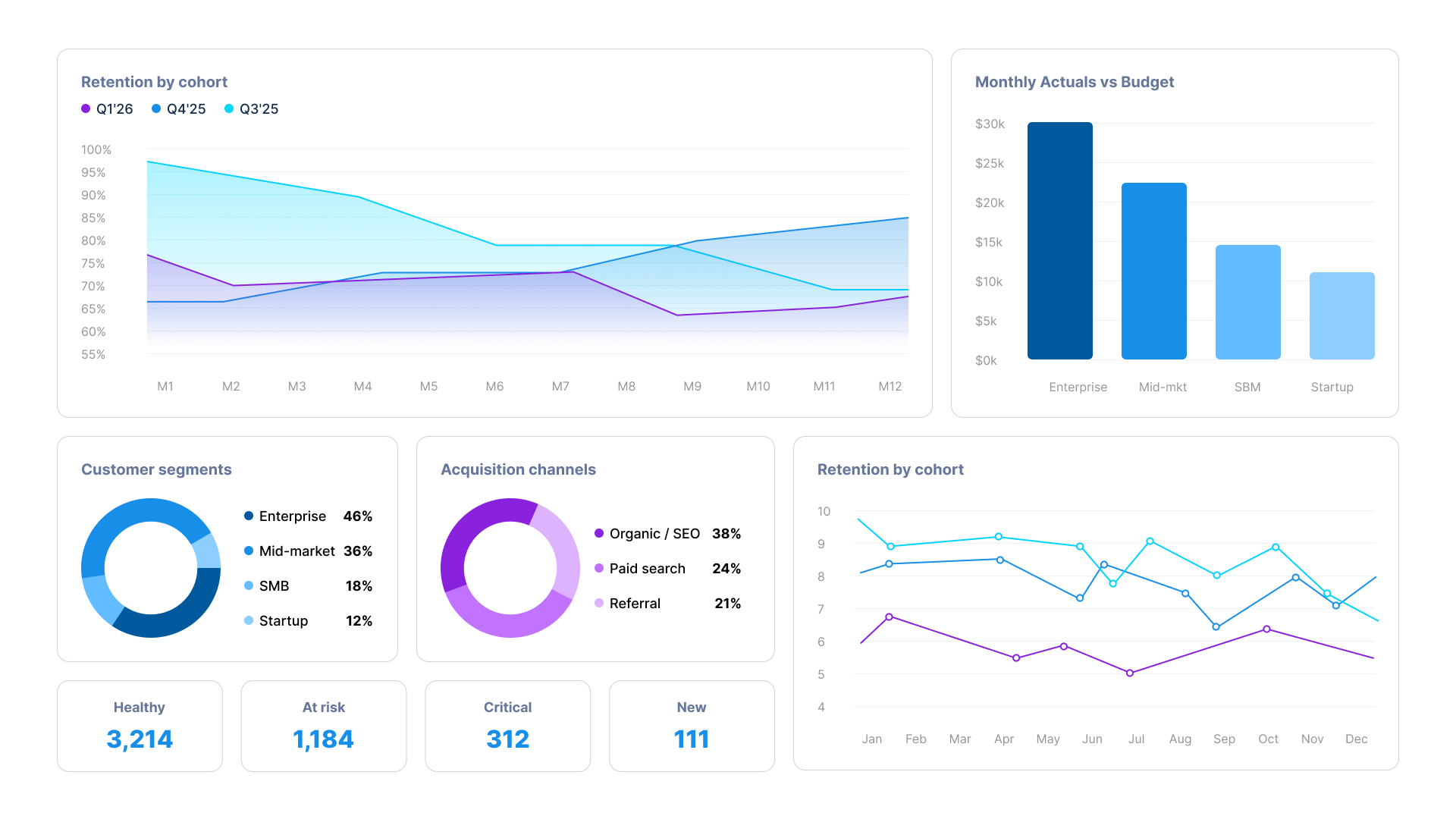
Power BI customer insights dashboard showing retention by cohort, customer segments, acquisition channels and monthly actuals
WHY CUSTOMER INSIGHTS ARE HARD TO GET

Raw customer data does not tell you much on its own. The value comes from connecting it.

Linking purchase behavior to acquisition source, tying engagement patterns to retention risk, and comparing segments to see what separates your best customers from those about to leave. A Power BI customer insights dashboard makes those connections visible. You can filter by segment, drill into individual cohorts, and track trends over time without waiting for an analyst to rebuild a report.

Icon
Customer data is spread across your CRM, product platform, support tool, and billing system with no single view
Icon
Reports take days to produce and are already out of date when they land in an inbox
Icon
Different teams use different definitions of the same metric, so numbers rarely agree
Icon
Retention signals are buried in data nobody has time to analyse consistently
Icon
No clear link between acquisition channel and long-term customer value
Icon
Segment-level analysis requires manual effort that most teams cannot do consistently

What Power BI Customer Insight Dashboards Cover

Each dashboard focuses on a specific customer decision area. Together they give customer success, marketing, product, and leadership teams a consistent, always-current picture of your customer base.

Customer Segmentation Dashboard
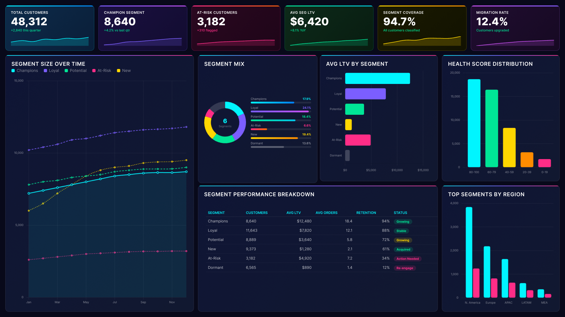
Power BI customer insights dashboard showing segment size over time, segment mix and avg LTV by segment
Divide your customer base into meaningful groups based on behavior, value, and engagement. Track how segments evolve over time. Understand which groups drive revenue, which are growing, and which need intervention before they disengage.
Abstract background with a diagonal split between light blue and dark navy blue colors.

Customer Retention Dashboard

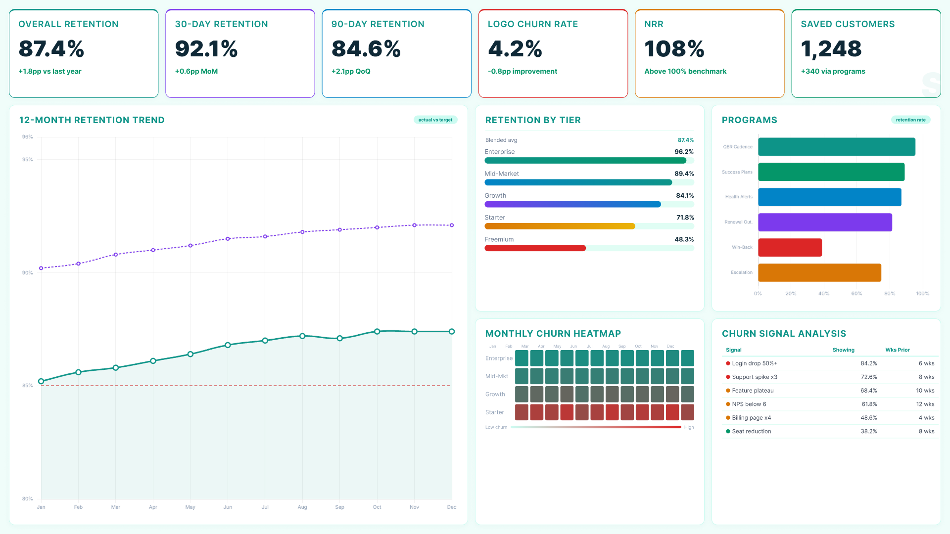
Power BI customer insights dashboard showing 12-month retention trend, retention by tier and churn signal analysis
Monitor retention rates across tiers, cohorts, and segments in real time. Track the signals that appear before customers leave. Give customer success teams the data they need to act before a customer makes a decision to churn.

Customer Lifetime Value Dashboard

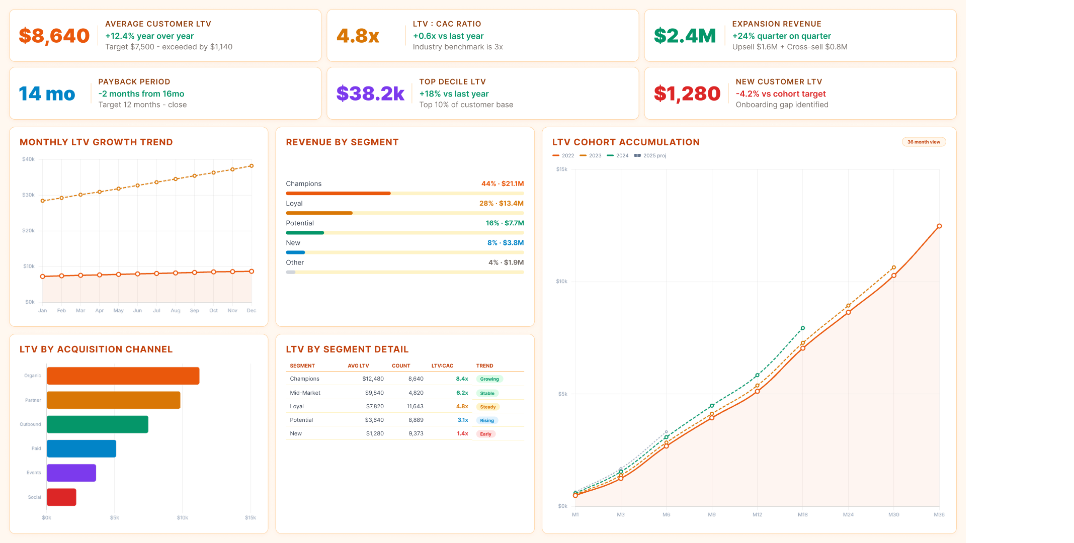
Power BI customer insights dashboard showing average LTV, LTV by acquisition channel, revenue by segment and cohort accumulation
Monitor lifetime value across segments, acquisition channels, and regions in one place. Identify your most valuable customer profiles and use that understanding to guide both acquisition and expansion strategy.
Abstract background with a diagonal split between light blue and dark navy blue colors.

Acquisition Performance Dashboard

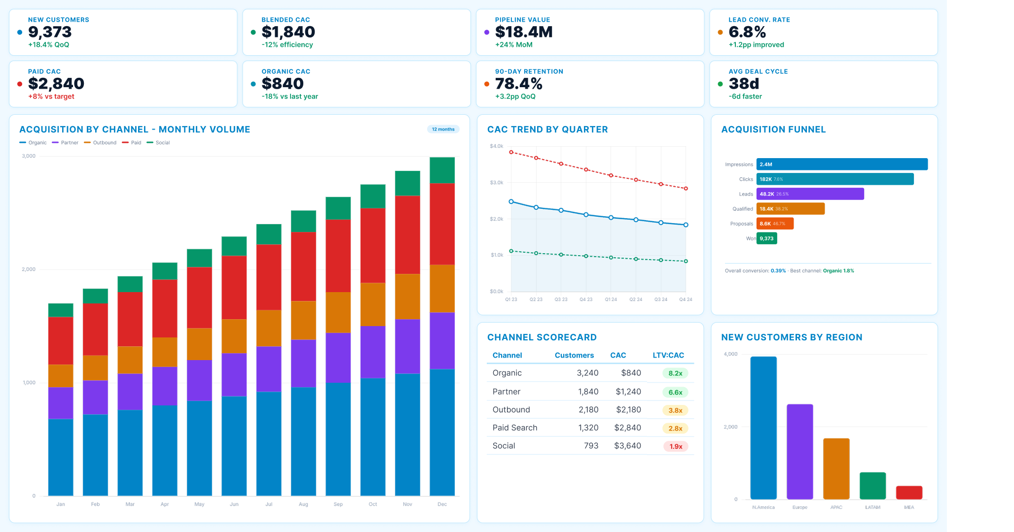
Power BI customer insights dashboard showing acquisition by channel, CAC trend, acquisition funnel and channel scorecard
Connect marketing and sales acquisition data to downstream customer behavior and revenue. See which channels and campaigns attract customers who stay and spend, not just customers who convert.

Engagement Analytics Dashboard

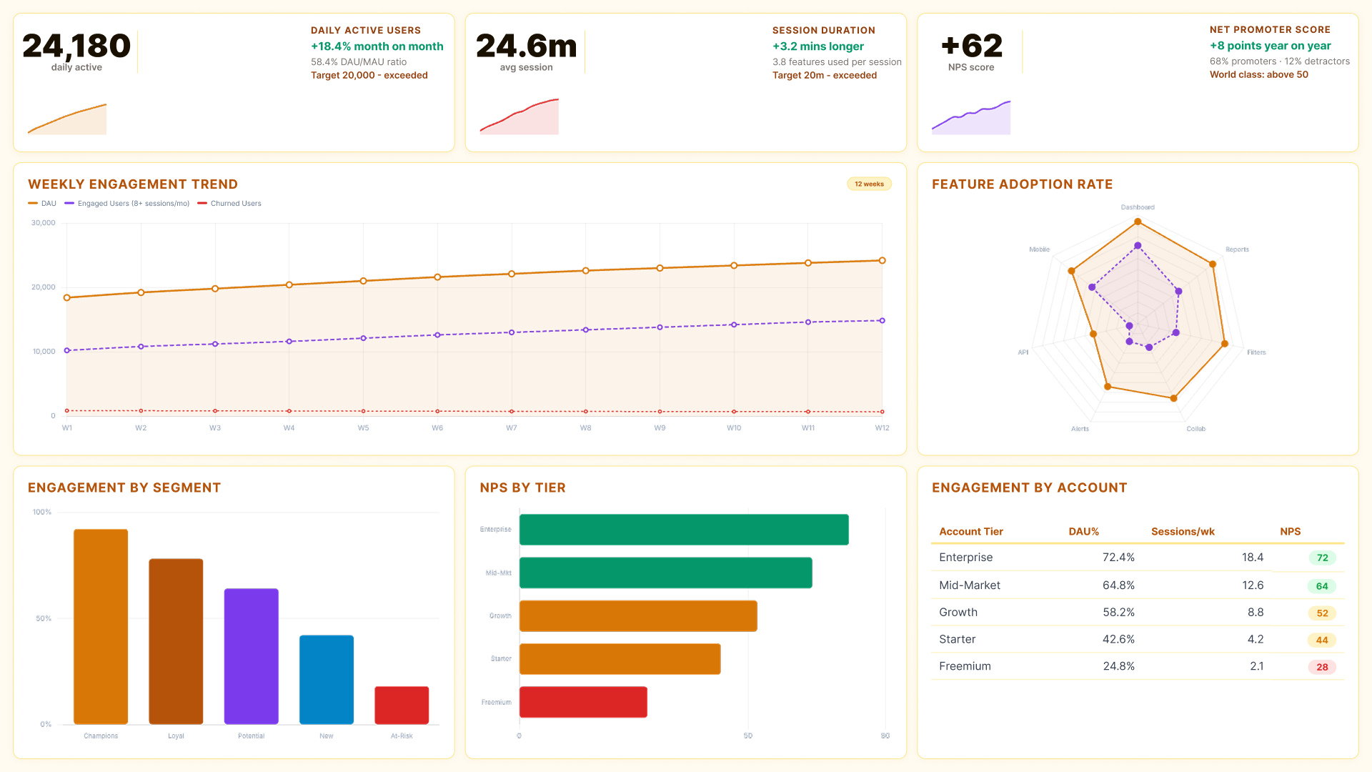
Power BI customer insights dashboard showing weekly engagement trend, feature adoption rate and engagement by segment
Track product or service engagement at the account and segment level. See which features or touchpoints drive the deepest engagement and which are underused. Use those signals to prioritize product decisions and customer outreach.
Abstract background with a diagonal split between light blue and dark navy blue colors.

Churn Analysis Dashboard

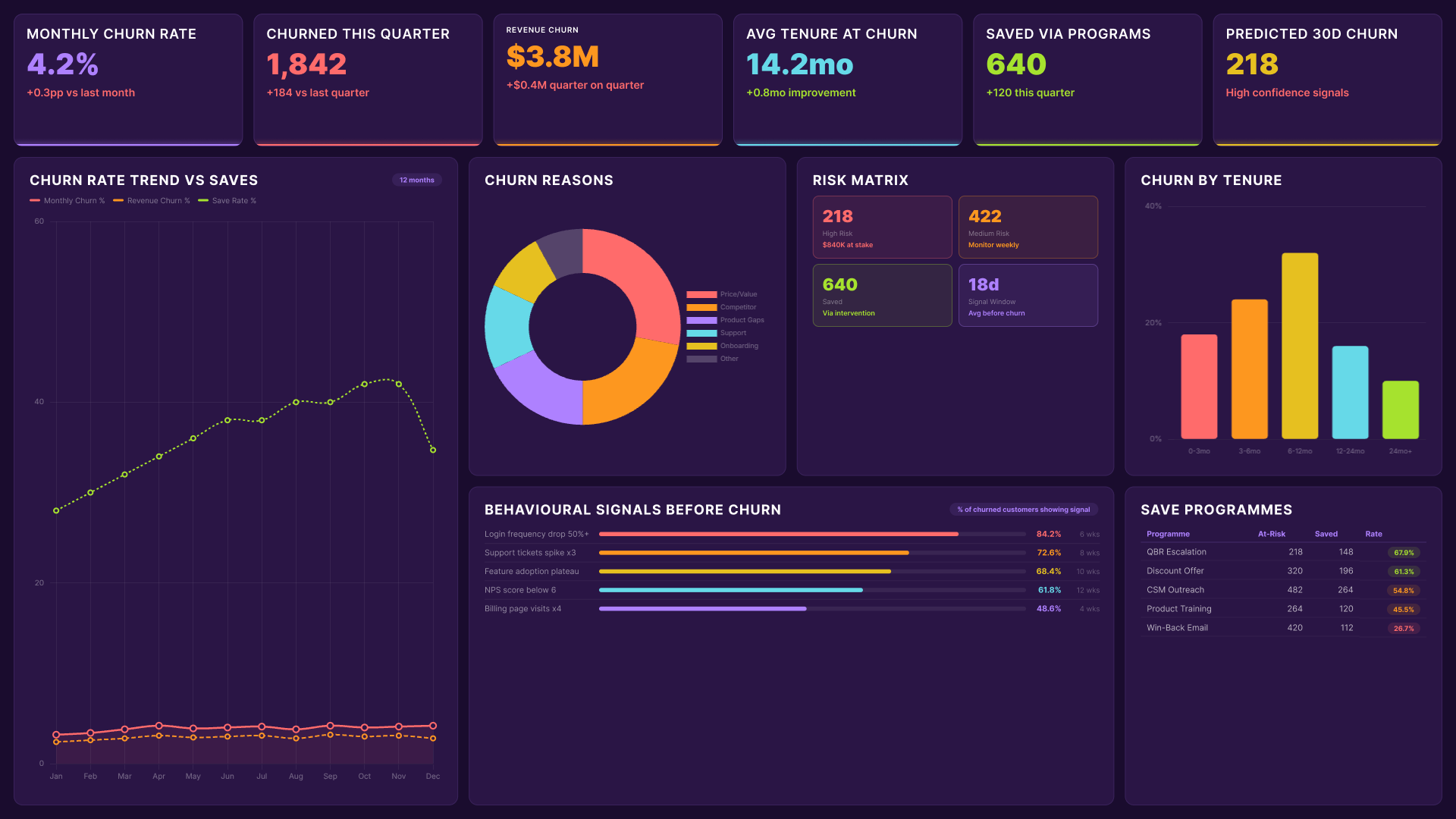
Power BI customer insights dashboard showing churn rate trend, churn reasons, risk matrix and behavioural signals before churn
Understand the patterns behind customer churn, including when it happens, which segments are most affected, and what behavioral signals appear before a customer leaves. Give your team the data to act before the decision is made.
WHO USES A CUSTOMER INSIGHTS DASHBOARD AND HOW

Customer data does not belong to one team. The same numbers mean different things to different people.

A well-built dashboard serves all of them. Reporting Hub is built on your existing Power BI environment so there is nothing new to learn and no parallel system to maintain. Filters, drill-downs, and segment comparisons are all built in. Any team member can explore the data without submitting a request to an analyst.

Icon
Customer Success Teams
Success managers use the dashboard to monitor account health daily. They can spot engagement drops, flag at-risk accounts, and prioritize outreach before a customer makes a decision to leave. Proactive retention starts with having the right signals in front of the right people.
Icon
Marketing Teams
Marketers use it to close the loop between acquisition and long-term customer value. They can see which campaigns and channels bring in customers who actually stay, and use that to sharpen targeting, messaging, and spend allocation across the funnel.
Icon
Product Teams
Product teams use engagement and usage data to understand which features are driving value and which customers are ignoring. Those signals inform roadmap decisions and help teams prioritize work that will have a measurable impact on retention and expansion.
Icon
Commercial and Sales Teams
Sales and account management teams use the dashboard to identify expansion opportunities inside the existing customer base. Accounts showing growth in usage, team size, or purchase frequency become the starting point for upsell and renewal conversations backed by real data.
Icon
Leadership and Finance
Executives and finance teams use it for the high-level view: lifetime value trends, retention rates, and revenue contribution by customer segment. They get the summary without requesting a report, and they can drill down when a number needs context.
Icon
Designed for Teams That Need Answers Fast
Leadership gets the summary view. Ops teams get the details. Everyone works from the same numbers. Get a Free Trial

Customer Insights Dashboard FAQs

Can the dashboard track customers across multiple products or brands?

Yes, it connects data across products or brands. Filters let each team focus on their relevant customers.

How is customer data kept secure when shared externally?

Reporting Hub uses row-level security and access controls. Each external user only sees the data they are permitted to view.

Can we customize which metrics appear for different teams or clients?

You can tailor each dashboard to show relevant metrics. Control the layout, data, and level of detail for each team.

Does it work if our customer data sits in multiple databases or platforms?

Yes. It connects to multiple sources and works with your existing Power BI models without consolidation.

Can we set up alerts when a key customer metric changes significantly?

Alerts can be set for key metrics like churn or engagement drops, notifying your team automatically when changes occur.